The New York Times (NYT) is one of the largest newspaper companies in the world, founded in New York City on September 18, 1851. Spotify is a music, podcast, and video streaming service launched on October 7, 2008. For this project, I designed a music streaming website from NYT in collaboration with Spotify.
DISCOVERY
The design of NYT website very simple and clean mostly in black and white, which seems to maintain the unique and traditional visual identity of New York Times.
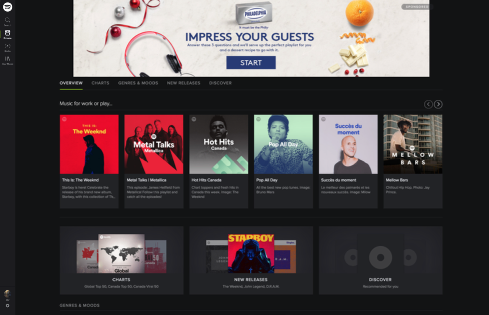
The Spotify website is somewhat overcomplicated so it is difficult for the user to find what they need especially since some images and letters are too small.
The icons are too illustrative and decorative.
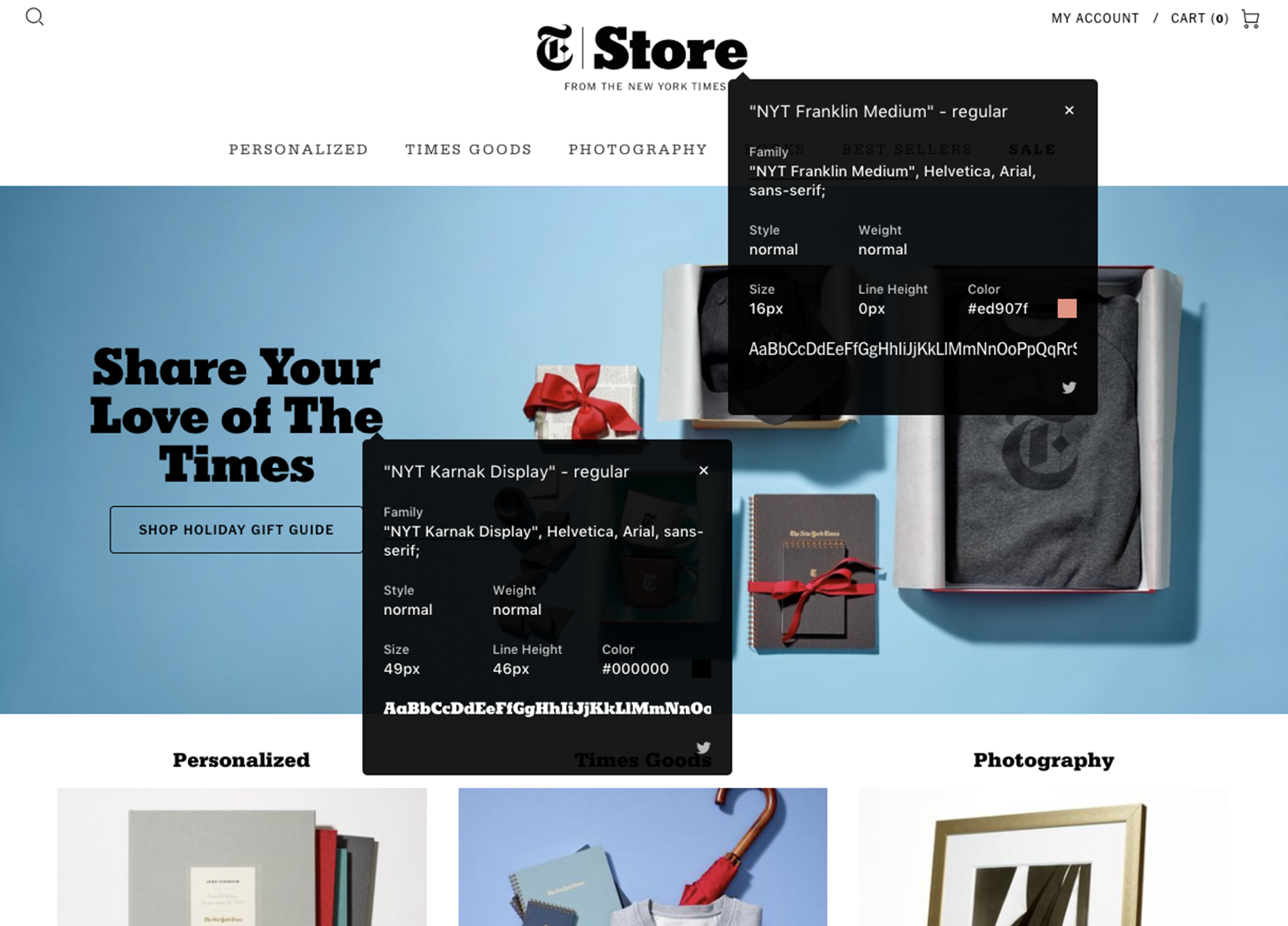
New York Times Web Page
Spotify Web Page
ICON REDESIGN
As part of the redesign, genre icons were redrawn to increase legibility. The original icons were too illustrative to be quickly recognized. They also hinder the design uniformity of the whole website. Therefore, I flattened and simplified the original icons, and changed to line icons in order to make them lighter and give them a more distinctive silhouette.
Icon Design in Illustrator
COLOURS & TYPOGRAPHY
NYT has old and symbolic fonts which represent it s design identity; NYT Cheltenham-Bold is used for its headlines, and a font family of NYT-Franklin, Aria and Helvetica is used as its sans-serif font family. NYT-Cheltenham, Georgia, Times New Roman are used for the body text. The main font for body content has recently changed from Times New Roman to Georgia.
The New York Times has the NYT Store website which provides unique gifts and photography from NYT. The website is categorized by Personalized, Branded Goods, Times Goods, Books, Sales, etc.
As it is shown above, the fonts used on NYT Store are overall sans-serif as opposed to the NYT's newspaper website, which seems for the sake of clean and modern design. In the meantime, NYT Store also keeps the font, NYT-Cheltenham in order to NYT's unique identity.
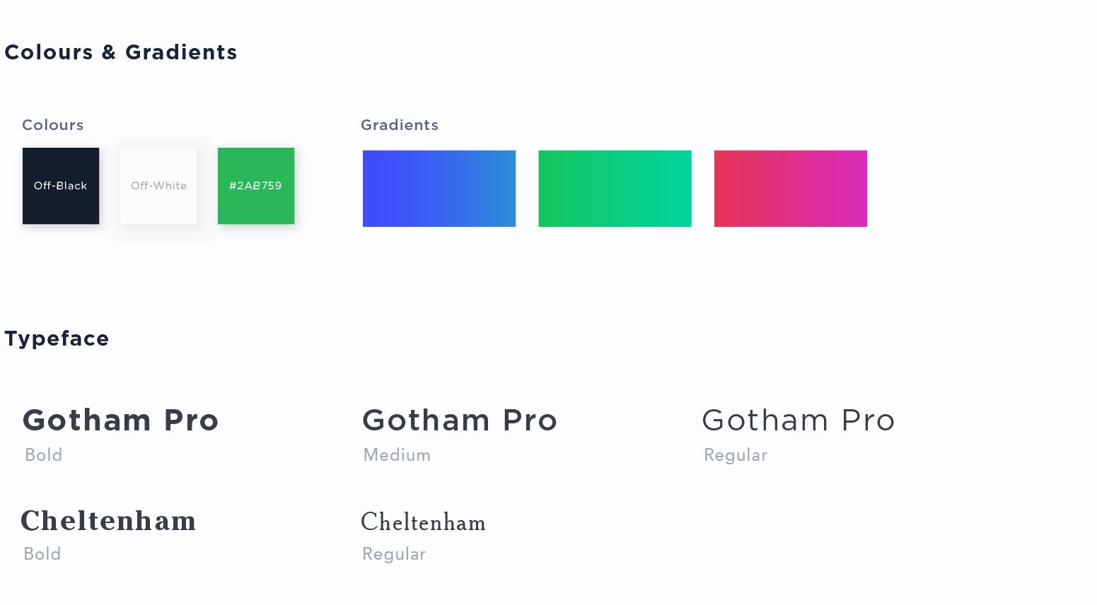
I chose off-black and off-white to maintain the NYT's design mood, and chose green from Spotify.
For the font, I used Gotham-pro. I considered keeping Cheltenham for headings, but decided against using it because its classical style did not fit a music streaming website. Also, I thought it wasn't necessarily essential for the music streaming website to be designed in the same font as the current website's in order to maintain design identity of New York Times. Therefore, I chose Gotham-pro which is not too different from Cheltenham, and is modern.
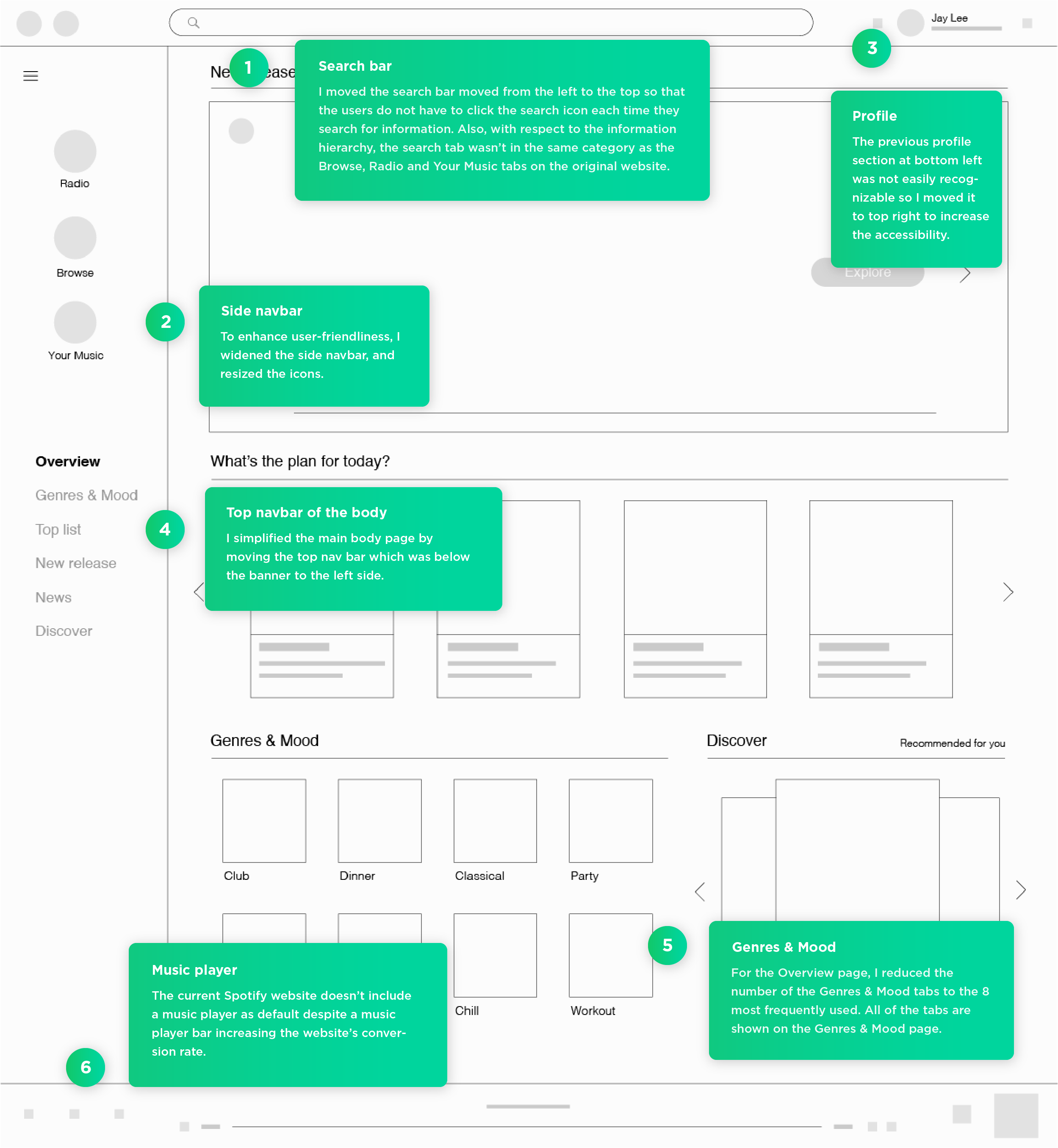
HI-FI WIREFRAME & ANNOTATION
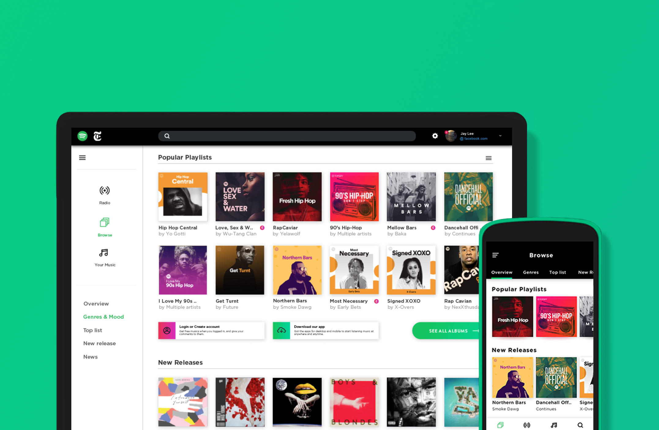
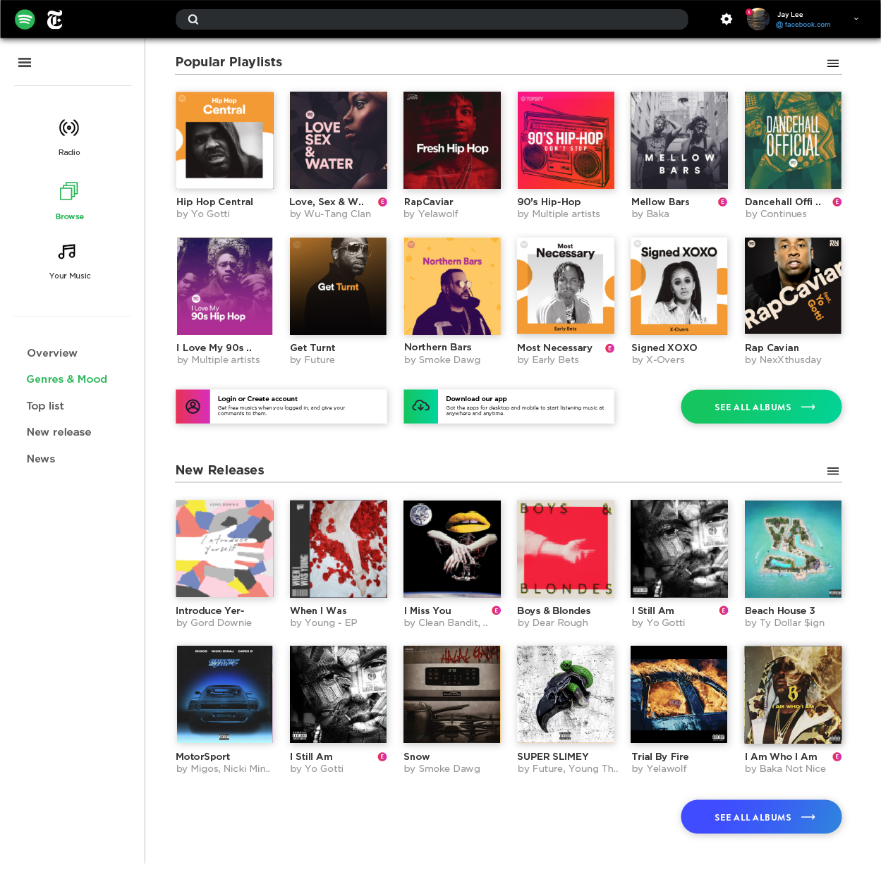
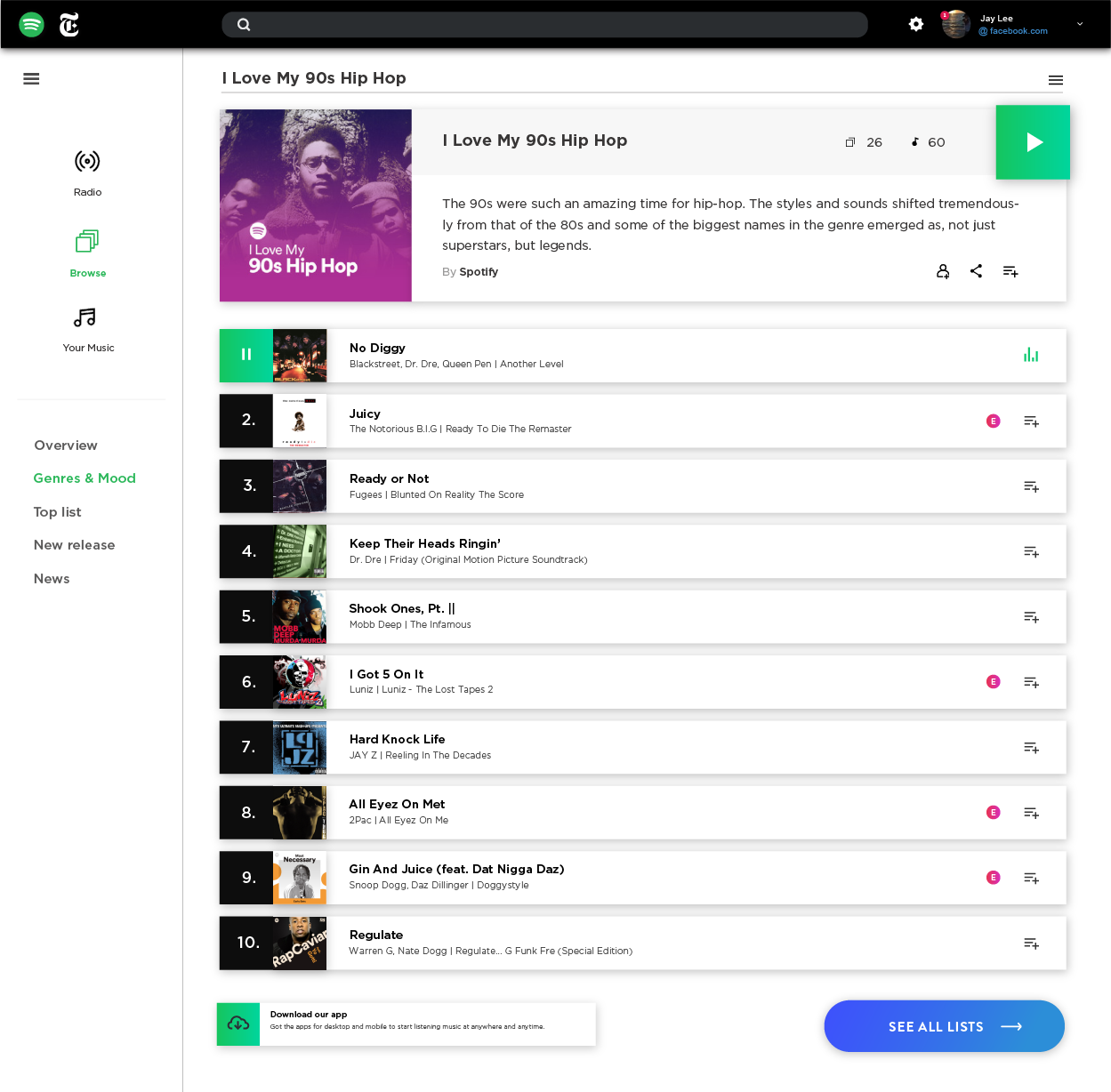
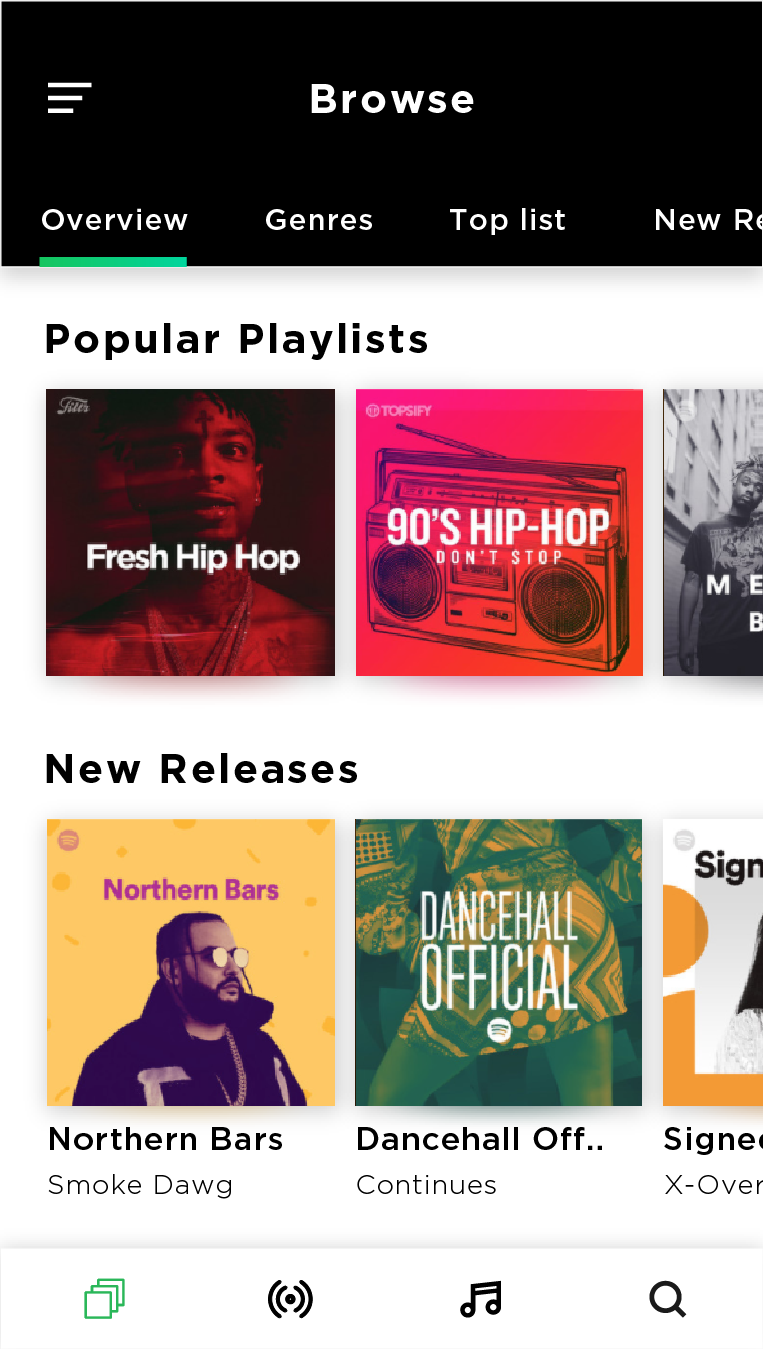
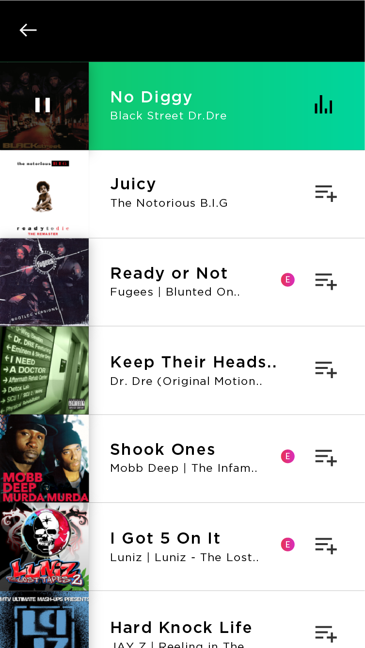
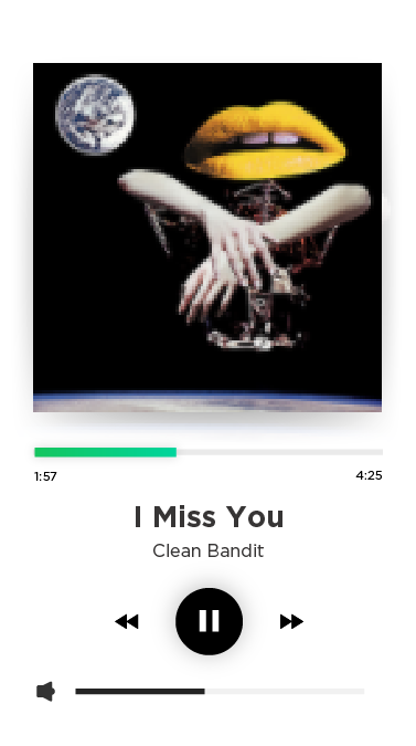
FINAL DESIGNS
NAVIGATION ANIMATION
TAKEAWAYS
Through this project, I learned how to create a new brand identity by balancing and combining two different design identities. I have learned a lot, going through this process and ultimately designing the end-product. I will be able to apply this experience to my next projects.
 PROJECT
 DISCOVERY
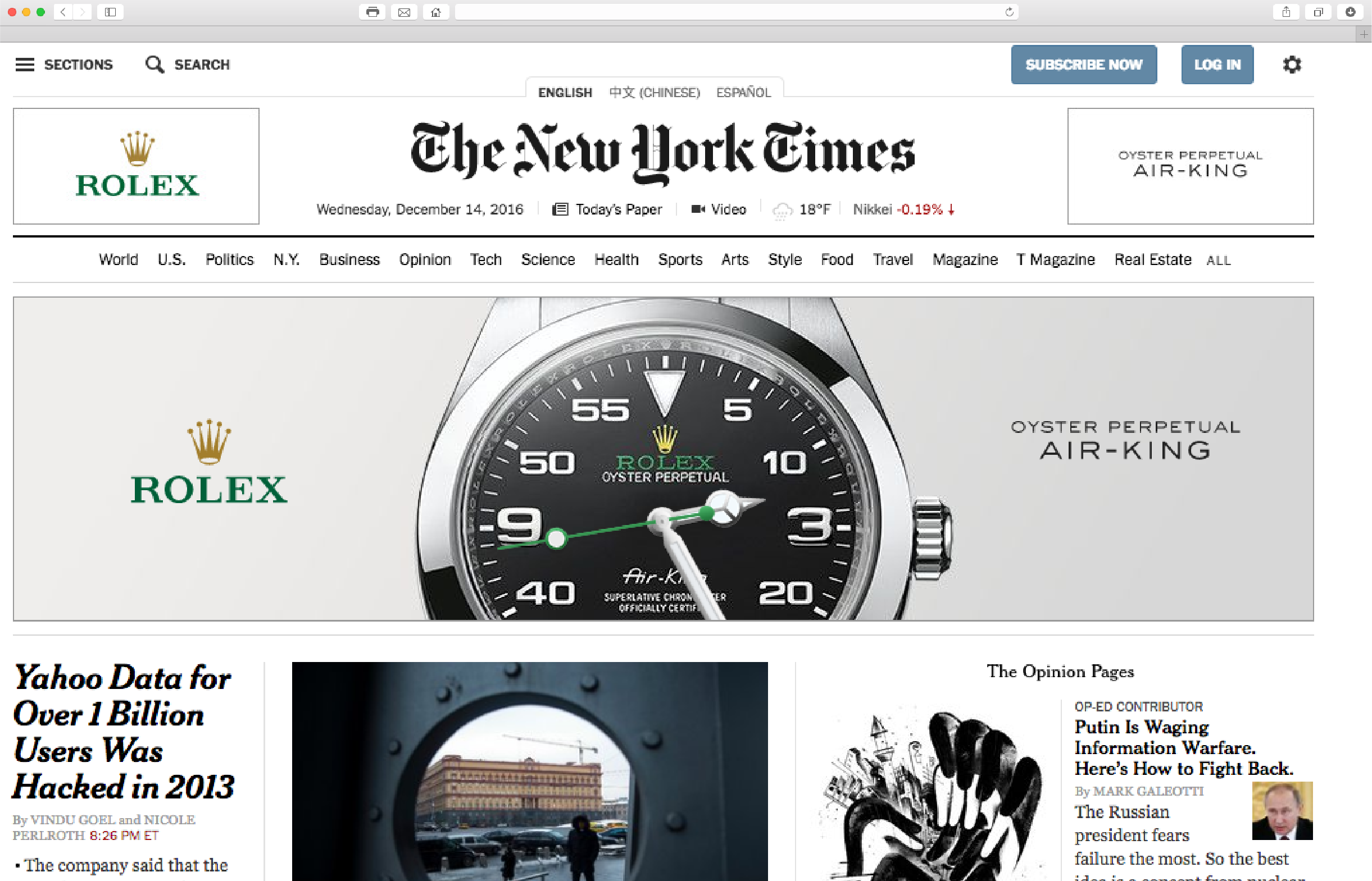
 ICON REDESIGN
 COLOURS & TYPOGRAPHY
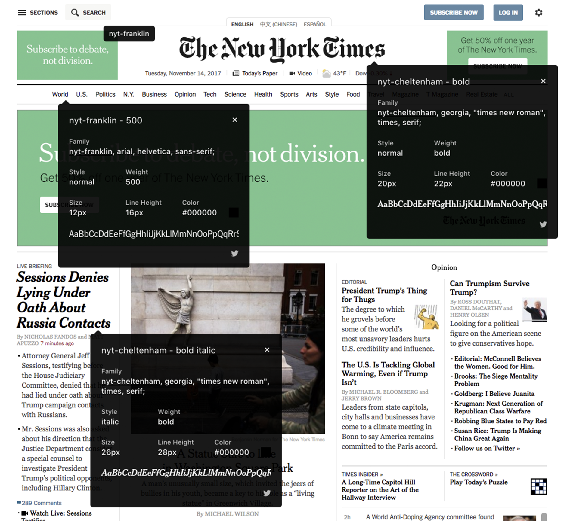
 HI-FI WIREFRAME & ANNOTATION
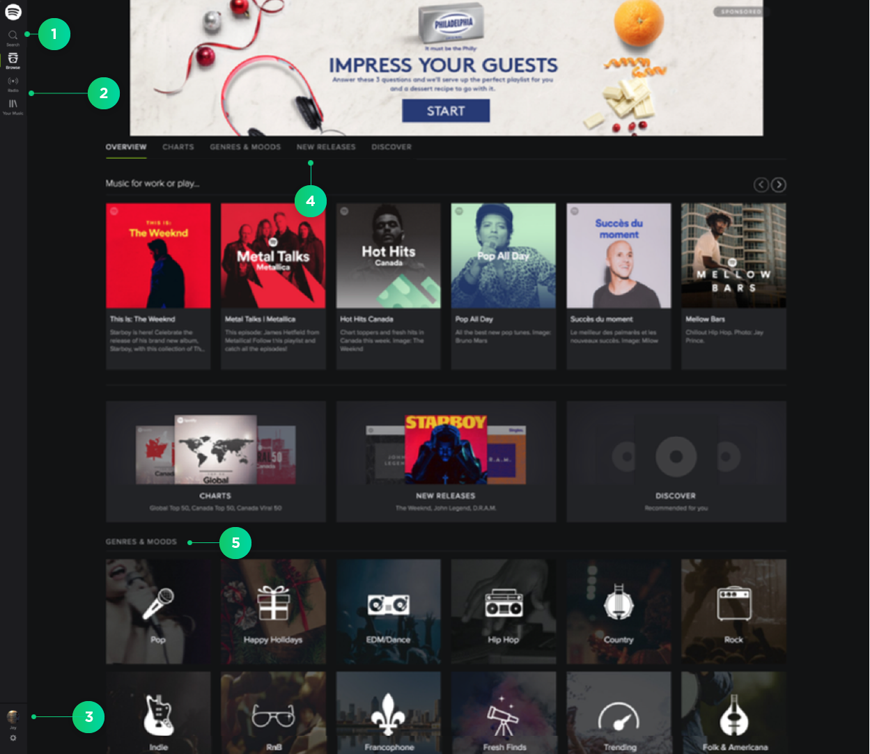
 FINAL DESIGNS
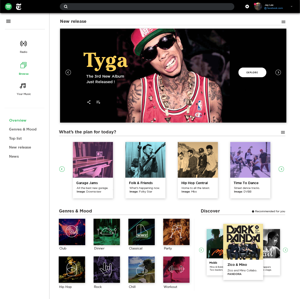
 NAVIGATION ANIMATION
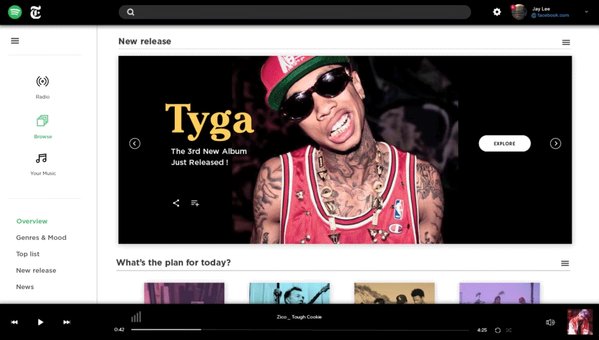
 TAKEAWAYS