As part of a 5-person design system committee, I collaborated on creating a Figma Design System Library and documenting components. We worked closely with developers to establish a Code Design Library using Storybook. This was an ongoing project.
SCOPE
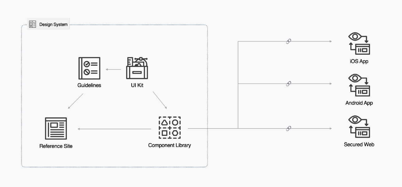
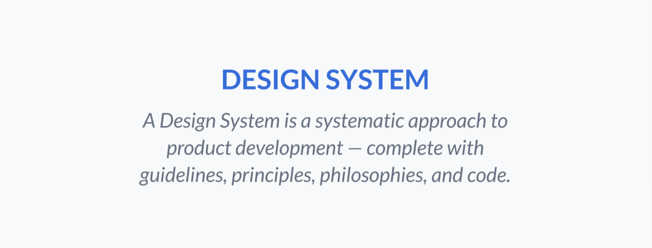
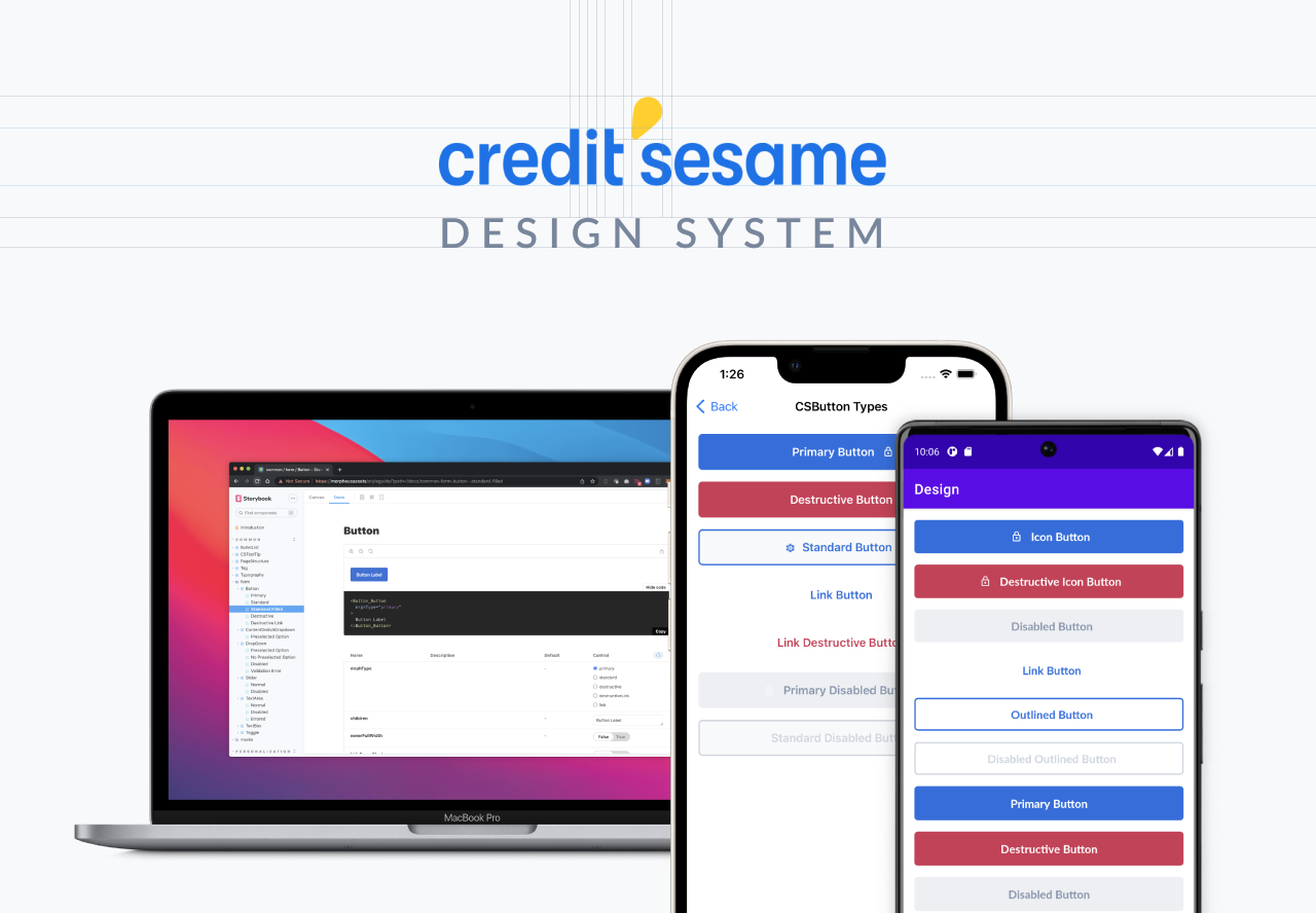
Design System
TOOLS
Miro, Figma, Jira, Storybook
PROJECT GOALS
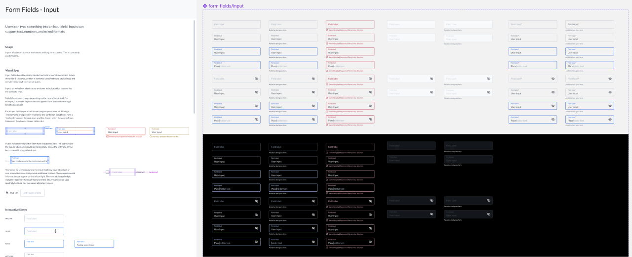
The project aimed to recreate the component library and documentations in Figma, transitioning from Sketch, and to establish an efficient design system component creation process that incorporates design, product management, and development. Our team utilized Auto Layout to build numerous components in Figma and also established the Zeplin Styleguide structure.
The design system team comprises product designers from each POD, and as the lead designer from Sesame Cash POD, my responsibilities include maintaining and adding new components to the component library, optimizing components for Sesame Cash screens, and ensuring that product managers create design system component tickets as needed. I also work closely with developers on the configuration and parameters for design system components.
Our team audited and recreated all Sketch components and documentations in Figma to establish an efficient design system process for designers, developers, QA, and the brand. As a lead designer, I maintain and optimize the component library for Sesame Cash and work with developers on configuration and parameter settings. Building and maintaining a design system is crucial for consistency in design, engineering, and brand identity, which is why I volunteered to be part of Credit Sesame’s Design System project.
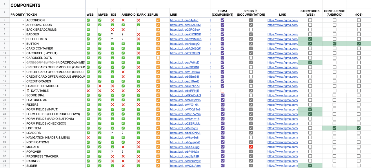
DESIGN SYSTEM COMPONENT DOCUMENTATIONS
The design system team organized and categorized all components used in the different POD designs, updated component spec documentation, and added UI states for each component in Figma.
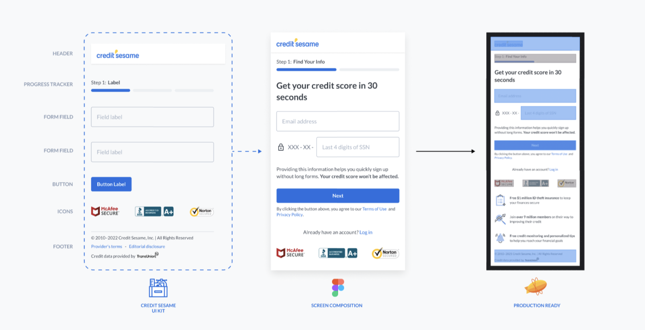
In order to avoid duplication and reduce implementation efforts for developers, it was essential that all components used by designers were from the Figma component library. When new components needed to be added, designers followed the framework of creating a new component and ensured they were properly linked and labeled to the library on Zeplin screens. This made it easy for developers to access the components they needed and avoid duplicated design components.
AUDIT COMPONENTS
Our team tracked the library components to ensure that each component was properly specified and that all related documentation was up-to-date. We maintained regular communication with the development team through this documentation to ensure alignment with the code library on the development side.
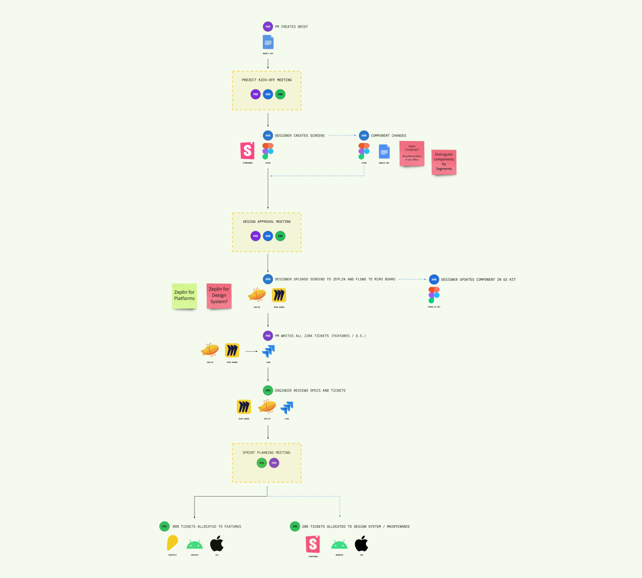
PRODUCT & DESIGN SYSTEM FRAMEWORK
Our team held several meetings with developers, QA, and product managers to establish an efficient end-to-end framework for updating and maintaining the Design System in line with the Sprint cycle.
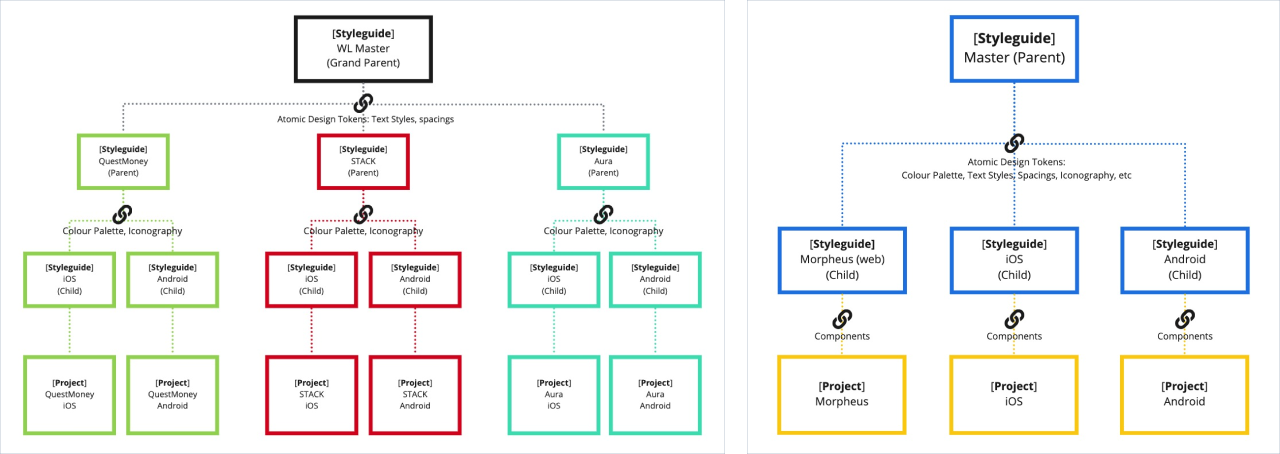
White Lable Products & Credit Sesame
ZEPLIN STYLEGUIDE STRUCTURE
I established a consolidated Zeplin Styleguide structure that applied to all Credit Sesame products, including white label products. The design elements were categorized into different levels of Styleguides, such as platform-specific ones, to ensure consistency across all products.
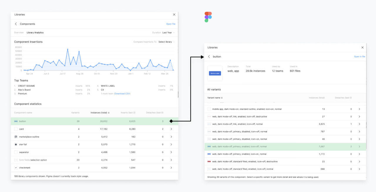
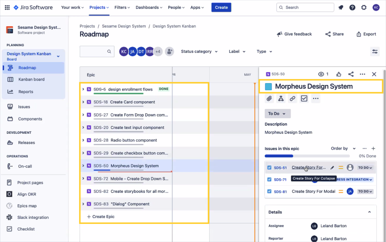
Figma Dashboard & Statistics
Jira Design System Tickets
💫 TAKEAWAYS
Design System is an ongoing process that requires continuous maintenance and updates to keep up with evolving product needs. Unfortunately, it is sometimes treated as a one-time project. However, the success of consistently scaling a product is heavily dependent on regularly maintaining and updating the Design System. It should be noted that the Design System not only impacts the product but also the brand identity. Therefore, it is crucial to prioritize the Design System and ensure that it receives the necessary attention and resources.