Guided by user research and feedback, this project aims to transform the Account Page on iOS, Android, and Web by introducing swipeable tabs for Positions, Orders, Watchlists, Events, and News. The original layout showed only positions and lacked critical information, making key features difficult to discover. The new design improves navigation, enhances visibility, and boosts engagement with actual user needs, aligning the cross-platform experience. By surfacing relevant content and streamlining access to core features, the redesign directly supports the business goal of increasing user engagement and long-term retention.
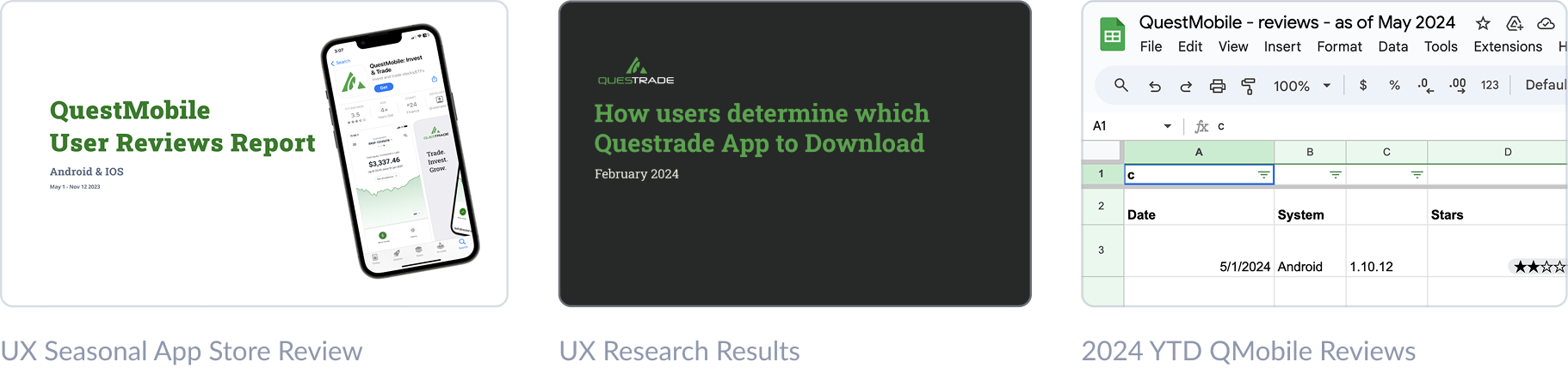
Based on an analysis of UX-focused App Store reviews, the QuestMobile Usability Report, and user feedback collected throughout 2024, we identified two key misalignments: 1. The original user persona no longer accurately reflects our current audience. 2. Many QuestMobile users are misdirected and should be using EdgeMobile instead.
UNDERSTAND THE USERS
The original persona no longer aligns with our current user base. This disconnect impacts design decisions and usability outcomes, as testing relied on outdated assumptions. To maintain relevance, personas must accurately reflect real user behavior, needs, and goals, informed by continuous research.
SOLUTION PLANNING
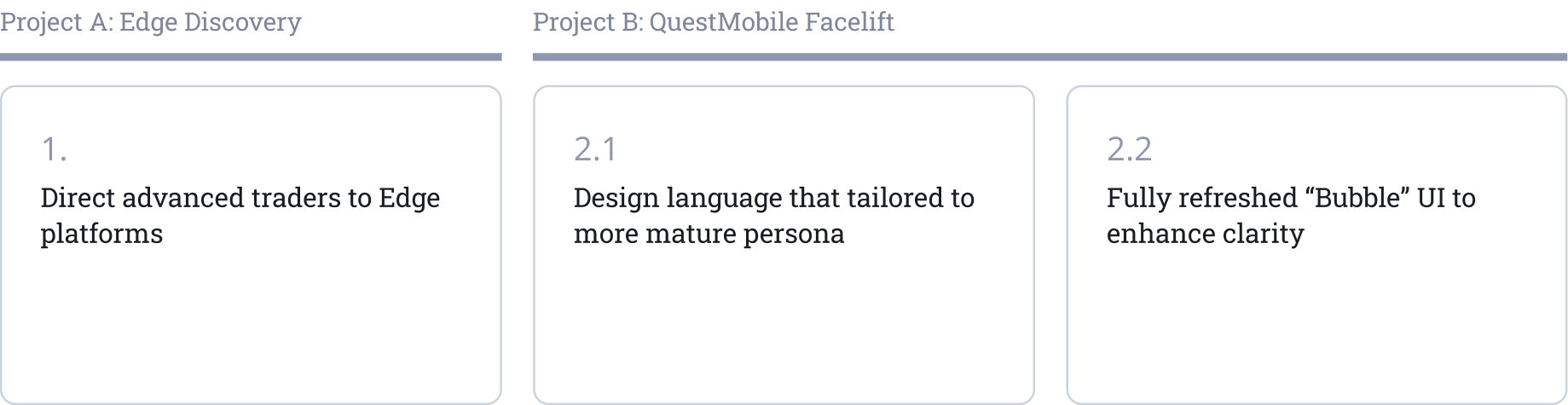
To address key user challenges, my team initiated two interconnected projects: Project A and Project B. While this case study focuses on Project B, I also contributed to Project A, which involved designing entry points that seamlessly guide QuestMobile users toward EdgeMobile, a trading platform built for more advanced investors.
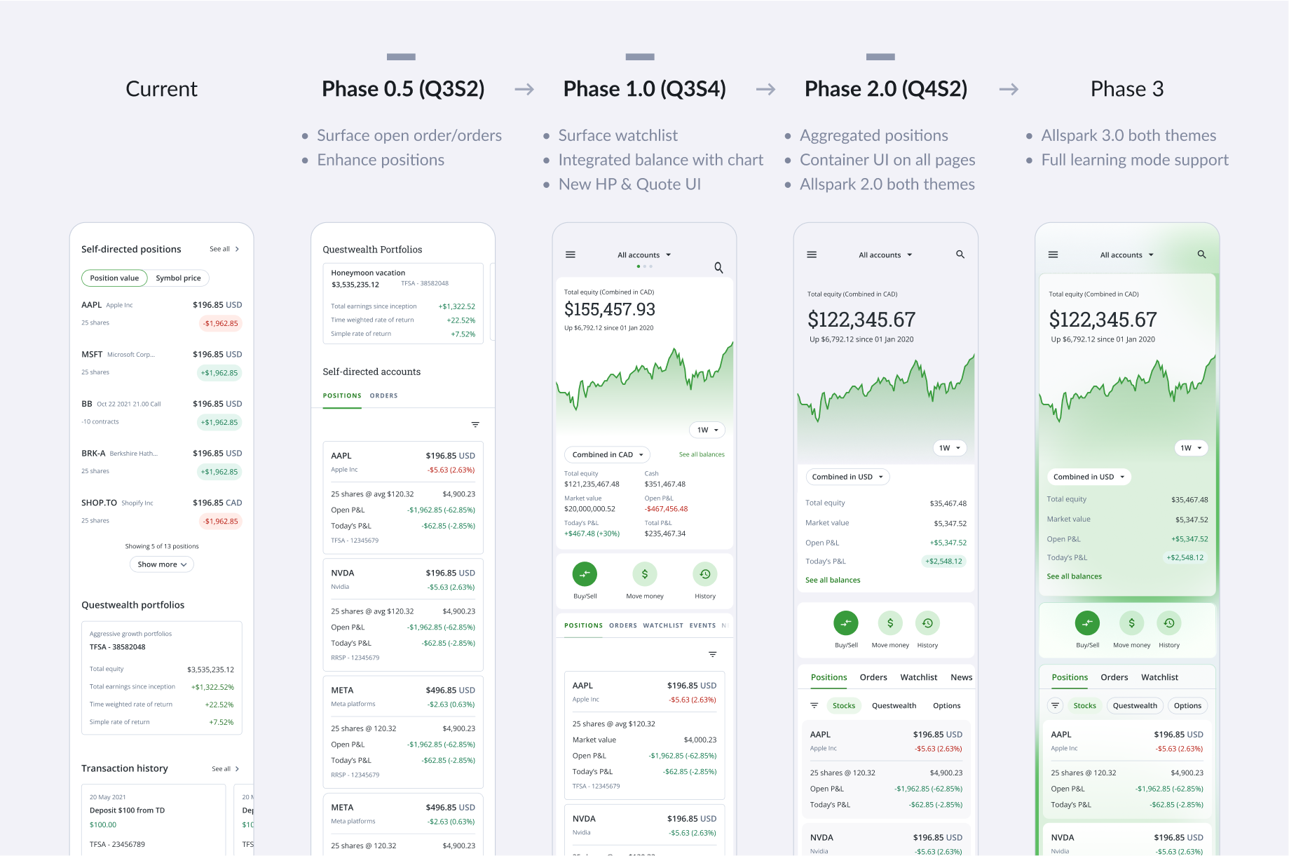
Project B was structured across four distinct phases, each aligned with the development team’s implementation roadmap and an ongoing UI rebranding initiative led by the brand strategy team. Coordinating across multiple functions with independent timelines was complex. Still, we prioritized strategic planning and cross-team collaboration to maximize project efficiency and ensure a cohesive outcome that balanced technical execution with brand vision.
TEAM TIME TRACKER
STRATEGY STAGE
GOALS & OBJECTIVES
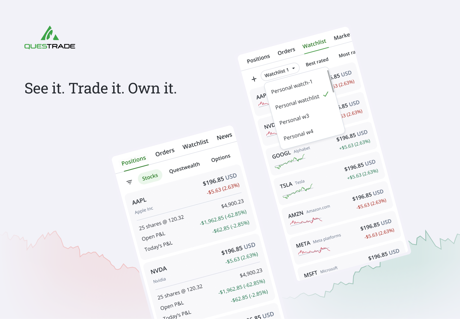
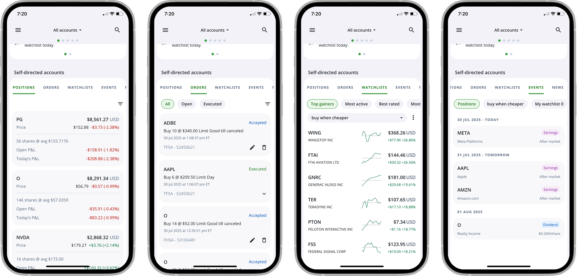
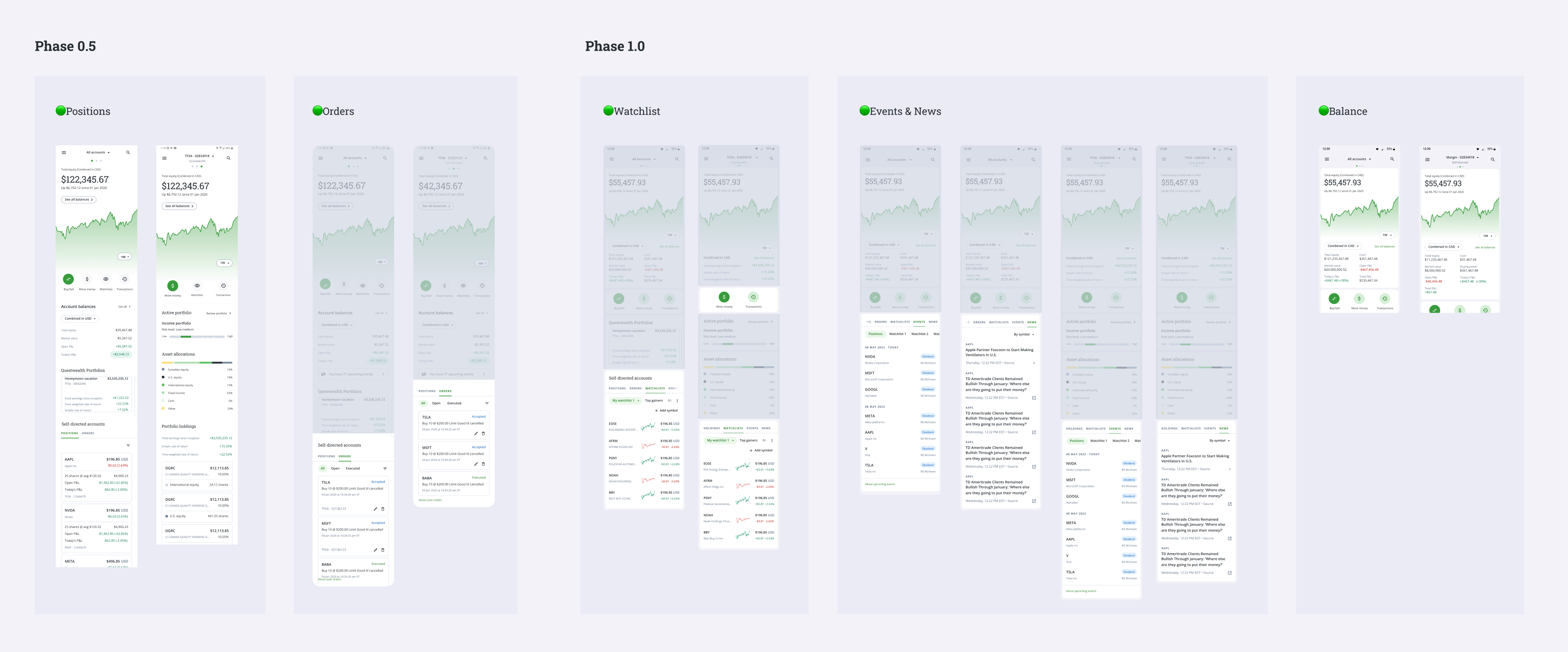
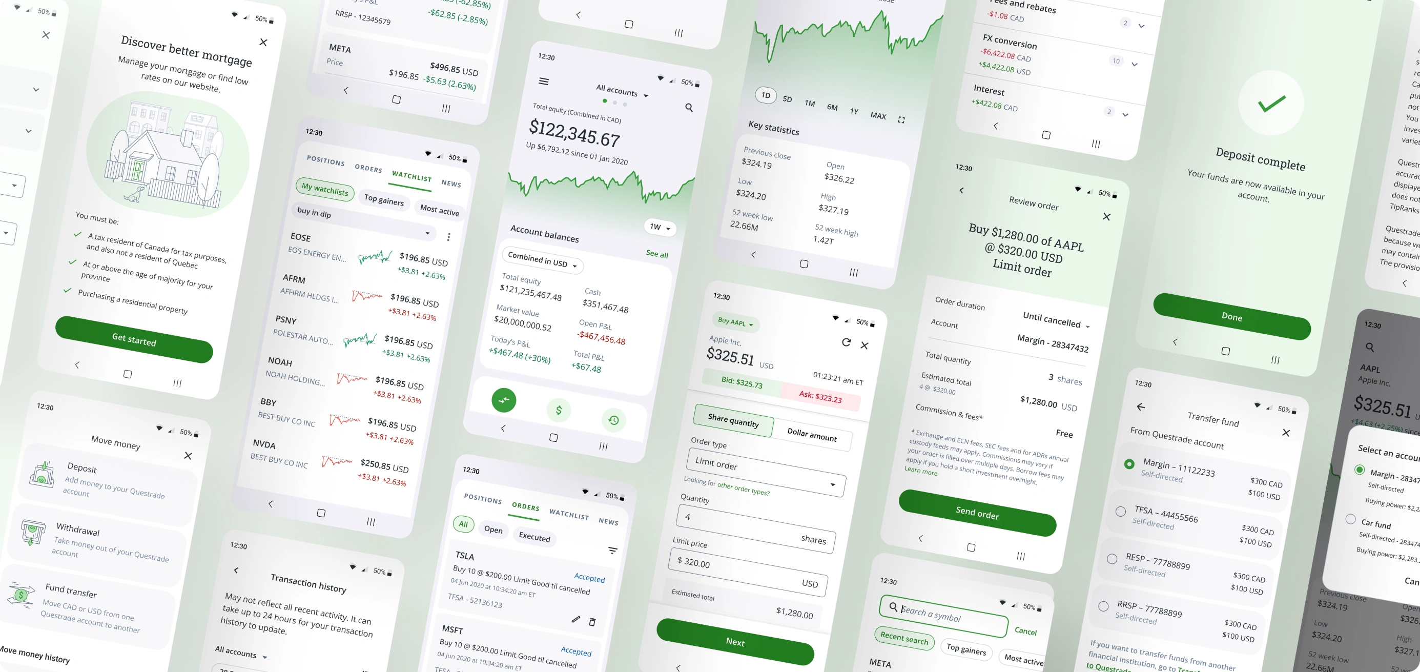
The main goal of the project was to improve user engagement and key metrics by transforming the QuestMobile Account page from a single-position view into a multi-tab experience by introducing tabs for Positions, Orders, Watchlists, Events, and News, all accessible in one place. I aimed to enhance the user experience of stock trading. This redesign allows users to access key information while remaining on the Account page. Swipe navigation lets users move left and right intuitively, making it easier to discover and interact with essential features.
The update also coincided with the launch of the new brand strategy UI system called Allspark 2.0. We integrated our refreshed brand identity into the interface through close collaboration between user experience and user interface teams. These improvements support business goals such as boosting engagement, increasing trade activity, and improving retention. They also reinforce the brand’s core values of clarity, professionalism, and user empowerment.
COMPETITIVE ANALYSIS
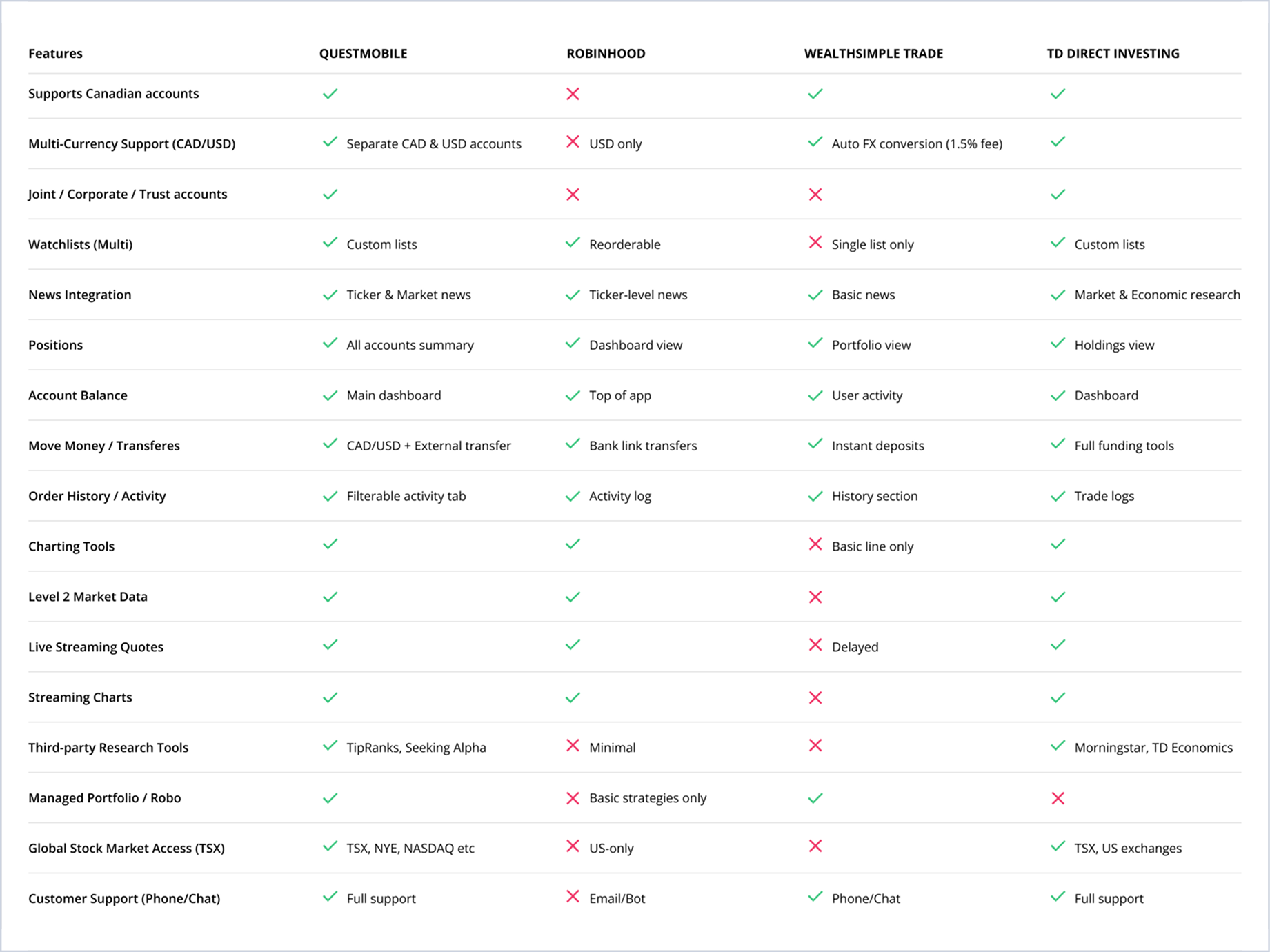
As part of the QuestMobile Facelift initiative, I conducted a targeted competitive analysis of leading investment platforms including Robinhood, TD, and Wealthsimple to benchmark core UX and UI patterns and identify usability gaps. These insights guided key decisions in redesigning the Account Page experience, ensuring intuitive access to essential features like Positions while improving visibility for frequently used tools such as Orders and Watchlists. I focused on highlighting Questrade’s unique strengths by delivering these elements as integrated, cross-functional components within a unified interface. By learning from competitors and refining our own design language, I improved discoverability, strengthened feature cohesion, and built a differentiated experience tailored to the needs of modern traders.
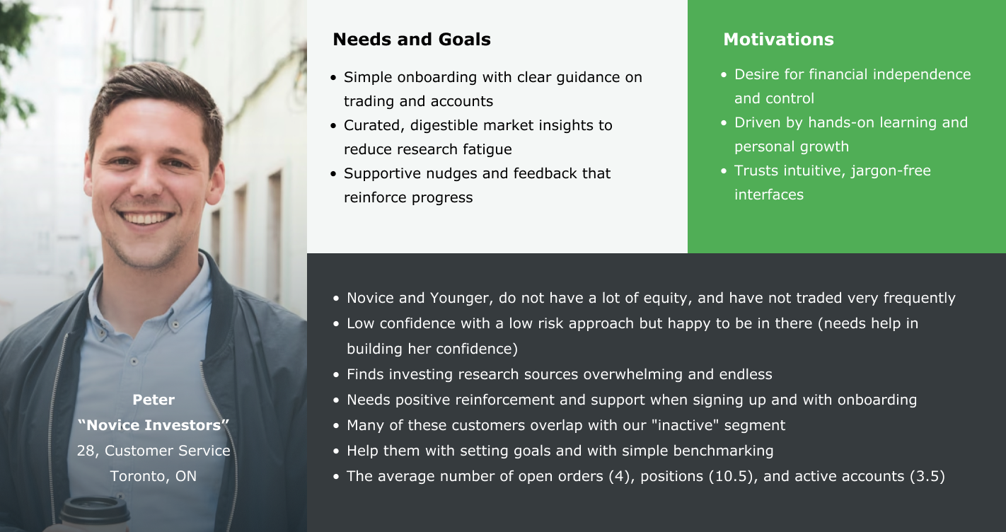
USER PERSONA
I clarified Peter as the clarified user persona for the QuestMobile platform, representing a novice investor whose profile emerged from updated research outlined in this case study. By centering design decisions around Peter’s goals and barriers, I translated strategic insights into solutions that better reflect the needs of real users.
DESIGN STAGE
DESIGN STRATEGIES
🔑 Modular UI Enhancements
Introduce modular tabs for Positions, Orders, Watchlists, Events, and News.
Enhance the design of the Position card by introducing additional data points within the updated layout.
Prioritize tabs based on frequency, urgency, and user goals.
🔑 Persona-Driven Design
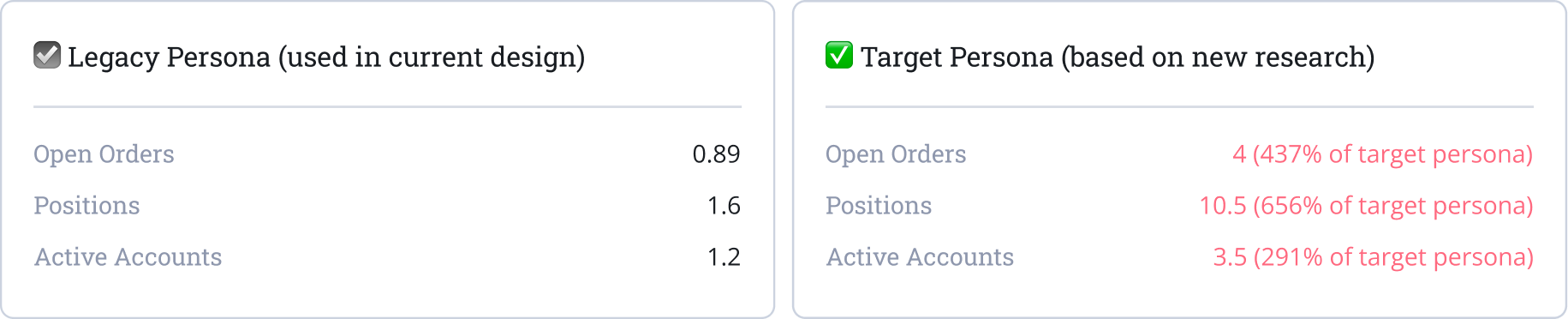
Refine self-starting investor persona shaped tone, pacing, and layout density (4 orders, 10.5 positions, and 3.5 accts).
Partner content design with UX/UI to align voice and emotional intent.
Improve discoverability and contextual clarity of key features like Orders and Watchlists.
🔑 Visual Identity Refresh
Leverage Allspark 2.0 for clearer, more interactive interface.
🔑 Navigation Simplification
Remove Market section and merged Trending into Watchlists to reduce clutter.
Relocate Transaction History as a discrete icon to streamline flow.
🛠 Technical Optimization
Designe modular APIs to support partial data refresh and reduce latency across tabbed views.
Optimized tab navigation by triggering lightweight data fetches without full page reloads, enhancing responsiveness.
Anticipated edge cases such as empty states, delayed responses, and API failures with fallback UI patterns.
Mapped error states to meaningful user feedback in collaboration with backend teams.
Defined API contracts for sorting, filtering, and pagination to ensure consistent state management across platforms.
VALIDATION STAGE
USER TESTING RESULTS
Positions Test Results - Part 1
Positions Test Results - Part 2
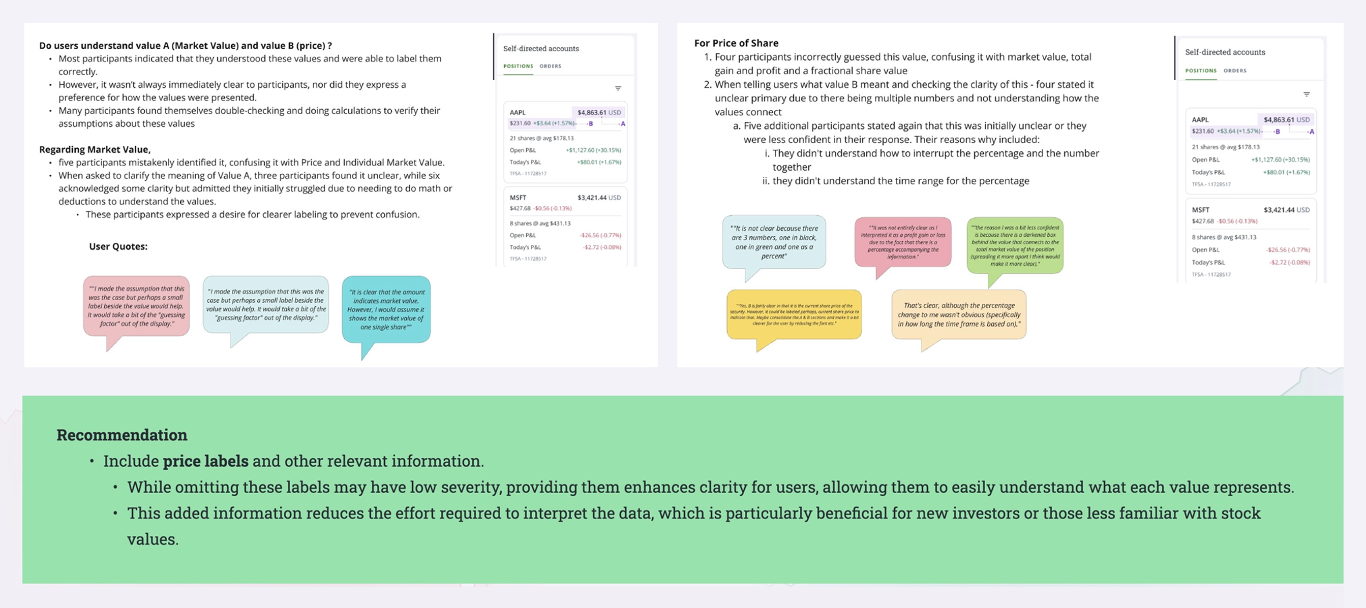
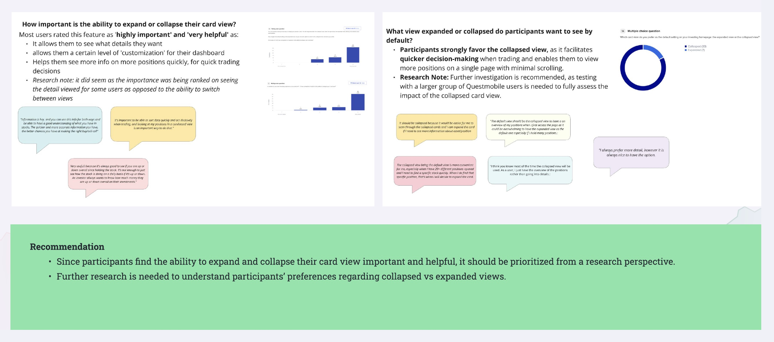
As part of the Position card redesign, user testing revealed a strong need for clearer and more consistent labeling of key data points such as market value, stock price, and today’s P&L. Inconsistent formatting made it harder for users, especially newer investors, to interpret performance at a glance and trust the information presented.
Participants also voiced strong interest in expandable cards to reduce clutter and improve flexibility during portfolio reviews. While this feature was well-received, it was ultimately scoped out of Phase 2.0 and earmarked for Phase 3 to allow deeper exploration of layout defaults and user-configurable views. These results emphasize the importance of clarity, consistency, and customizability in supporting investor confidence and diverse workflows.
IMPACT STAGE
INFORMATION ARCHITECTURE
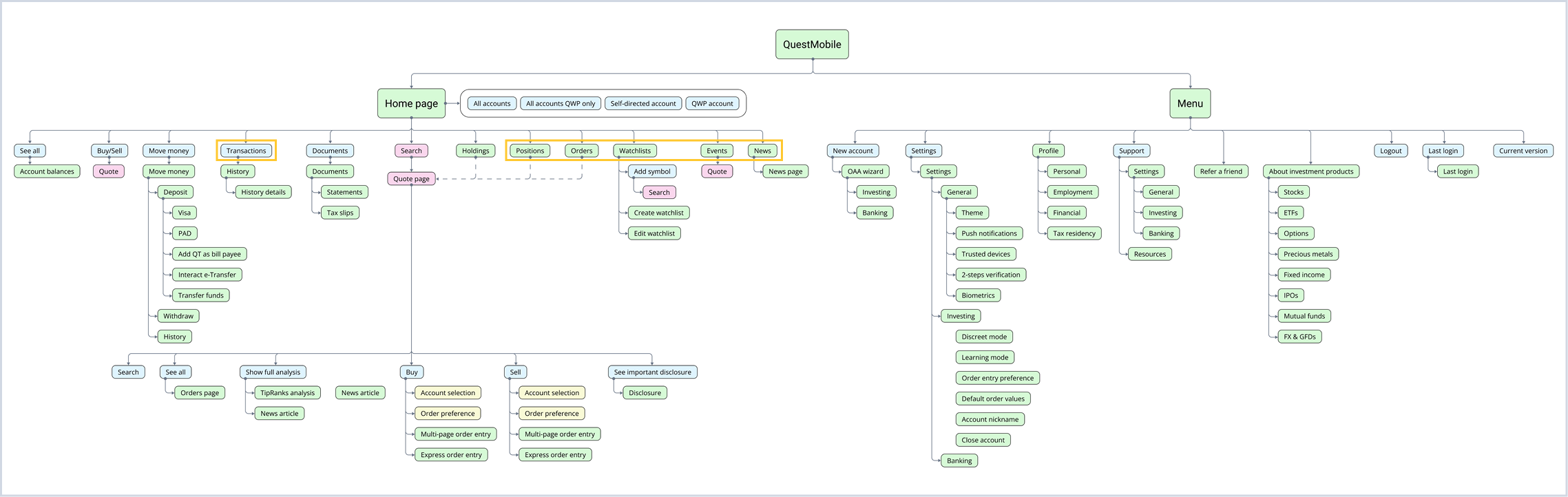
I designed a streamlined and intuitive information architecture that balanced business priorities with actual user needs. Working closely with stakeholders and drawing on targeted user research and behavioral analysis of novice investor workflows, I built a feature hierarchy grounded in user intent and frequency of use. In response to user testing, I removed the Market section and repositioned Transaction History as a discrete icon button to reduce clutter and improve accessibility. This updated scalable structure aligned with Questrade’s strategic goals and helped users complete essential tasks more easily, reinforcing trust and boosting platform adoption.
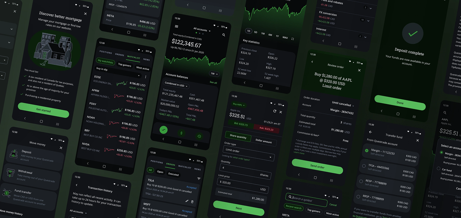
FINAL DESIGN
The final design for the Facelift project focuses on improving navigation, readability, and decision-making flow. A tab format allows users to switch between views easily, helping them compare positions and monitor different parts of their portfolio without losing context. Key datapoints such as market value, stock price, and P&L are clearly labeled and consistently styled to reduce confusion. With swipeable layouts and intuitive grouping, the design helps users make faster, more confident investment decisions. I also updated other screens and component designs that were affected by the main design change, including the Quote Page. These updates addressed dependencies and were accompanied by full specification documentation, delivered for both development implementation and component documentation updates.
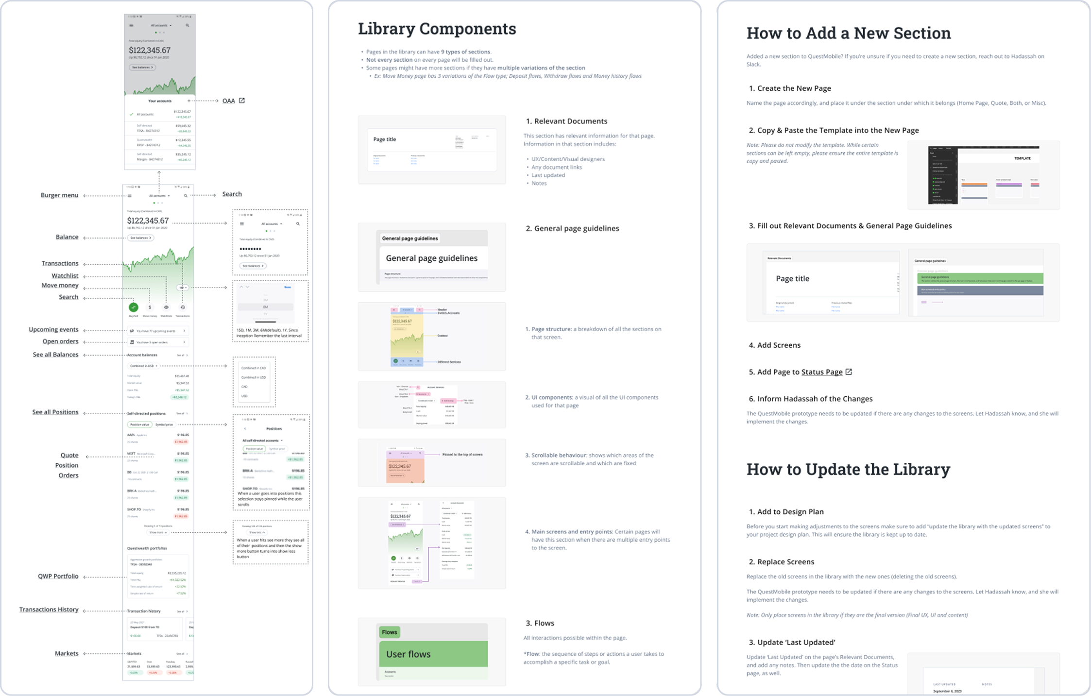
To support scalability and foster cross-functional collaboration, I led the management of the centralized QuestMobile Library throughout my employment at Questrade. This documentation hub consolidated design files, usage guidelines, and specifications into a single source of truth, streamlining developer handoff, minimizing QA overhead, and accelerating onboarding for new contributors
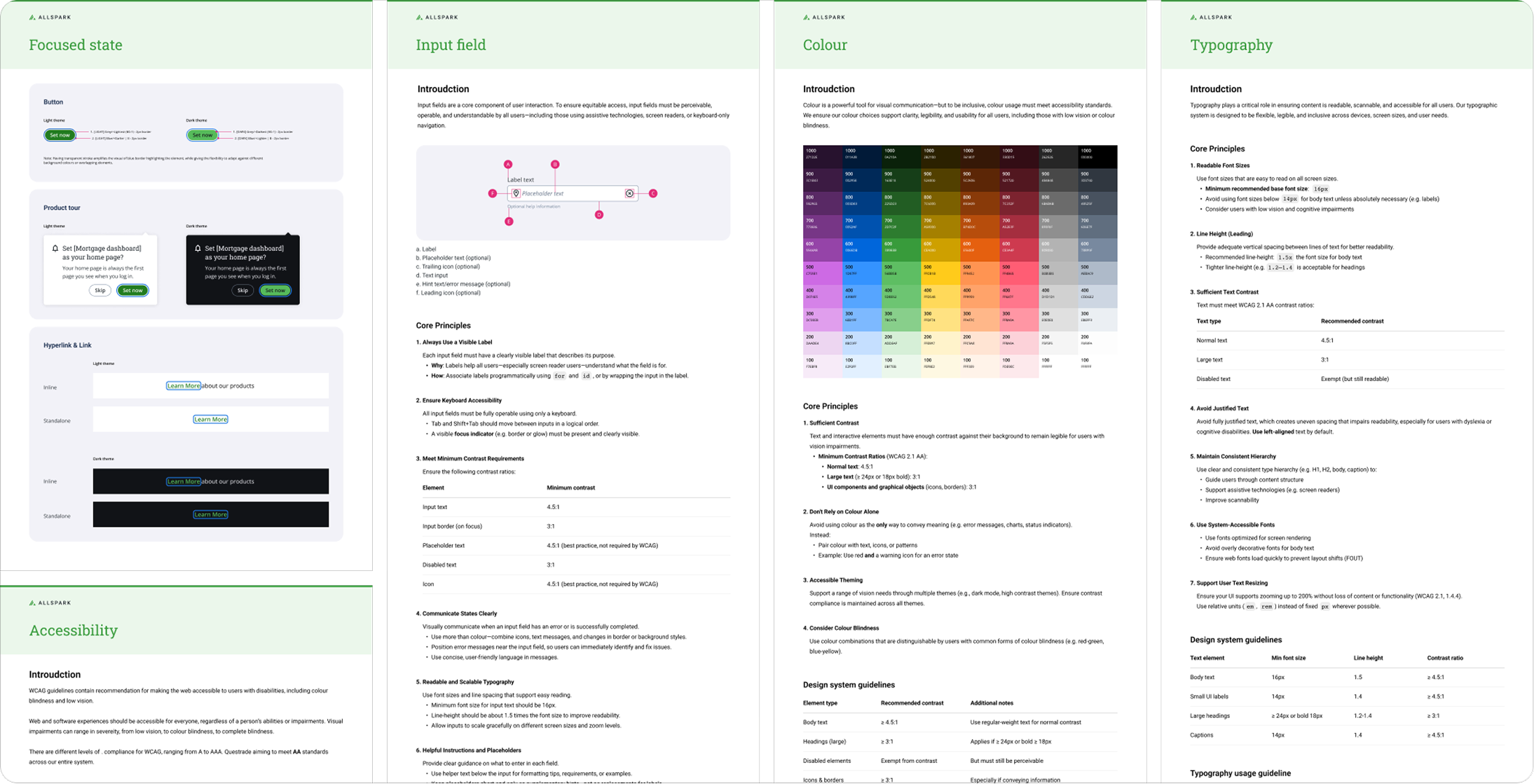
WCAG 2.1 ACCESSIBILITY
My team ensured that all components and designs were fully aligned with WCAG 2.1 standards. We conducted thorough testing for color contrast, font size, tap targets, and navigational hierarchy. The clean design of the app was not just about visual appeal but it was thoughtfully created to provide functionality and inclusivity for all users.
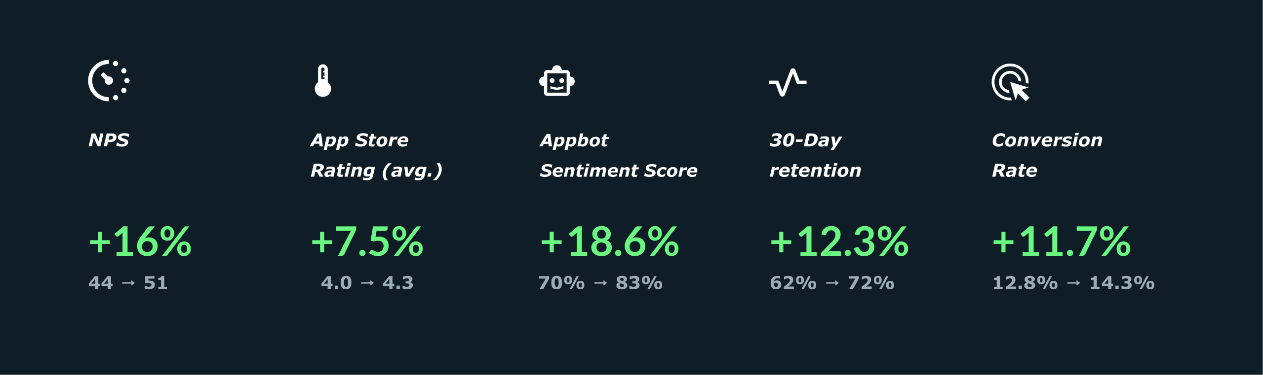
KPI & METRIC IMPROVEMENT
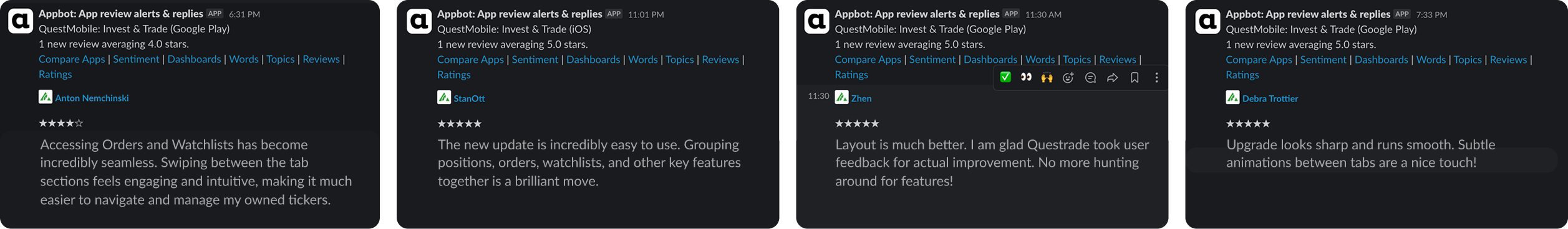
Users praised the account clarity and consistent UI, noting especially how the tab-based navigation elevated the interaction design experience. The tabs introduced intuitive wayfinding and reduced cognitive load, making it easier to access key features like Orders and Watchlists with minimal effort. This design improvement not only enhanced usability but also boosted engagement among newer clients, while streamlined onboarding pathways increased retention. The merged architecture, including the integration of Trending into Watchlists, helped maintain user focus and reduce bounce rates. In addition, the Allspark 2.0 interface strengthened platform trust through polished transitions and a responsive layout, leading to increased user confidence and more frequent engagement.
Appbot - User Reviews
QuestMobile All Account Page
REFLECTION STAGE
💫 TAKEAWAYS
Align user-centric design decisions with business strategy and brand principles to deliver value that is both meaningful to users and scalable for long-term growth.
Ensure a frictionless experience for key actions like 'Buy' or 'Sell,' complemented by responsive feedback and minimal interruption to the user flow.
Define UX-driven API contracts that account for edge cases, error handling, and filtering/sorting logic by collaborating with backend teams to ensure the API enables efficient user flows and consistent state management.
Minimize redundant API calls when switching views or updating lists; determine when full watchlist refreshes are truly needed versus partial updates.
Implement smart loading states, infinite scrolling, and effective caching strategies to boost perceived performance.
👣 FUTURE VISION FOR EXPANSION
Facelift was envisioned not merely as a redesign but as a strategic foundation for long-term growth. Beyond refining investment experiences, our ambition was to evolve QuestMobile into a dynamic ecosystem for all things personal finance, including mortgages, savings, credit, and more. With modular architecture at its core, the platform was built to accommodate future expansion without disrupting user flow. As we enter Phase 3, this vision comes into sharper focus. The rollout of AllSpark 3.0 and full learning mode support introduces intelligent personalization across the experience, adapting dynamically to individual financial journeys. Monitoring real user behavior at scale now informs continuous optimization, ensuring each interaction becomes smarter over time.