The project aimed to reorganize the visual and feature hierarchy of the Sesame Cash tab's dashboard experience, aligning it with the updated business value proposition. The goal was to enhance the conversion rate of the Sesame Cash tab and its features, ultimately increasing the funding for Sesame Cash users.
The primary objective was to increase user retention within the Sesame Cash tab and its features, while also elevating the conversion rate for Sesame Cash sign-ups. Simultaneously, the project aimed to reorganize the feature hierarchy, ensuring a harmonious alignment with the evolving business value proposition.
TEAM
1 Product Designer and 1 Product Manager
DURATION
5 weeks
PROJECT BACKGROUND
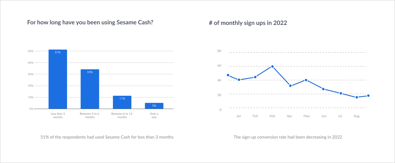
This project was prompted by insights gained from both a comprehensive user survey and user data. Surveying 1,043 participants, it was evident that 51% of users interacted with Sesame Cash for less than 3 months, leading to an retention rate lower than anticipated. Furthermore, a decline in the number of monthly sign-ups was also identified.
PROBLEM FRAMING
🔍 Why are existing Credit users hesitant to sign up for Sesame Cash?
🔍 What factors cause the low retention rate of Sesame Cash?
🔍 What specific user pain points encounter within the Sesame Cash experience?
usertesting.com
IDENTIFY USER PAIN POINTS
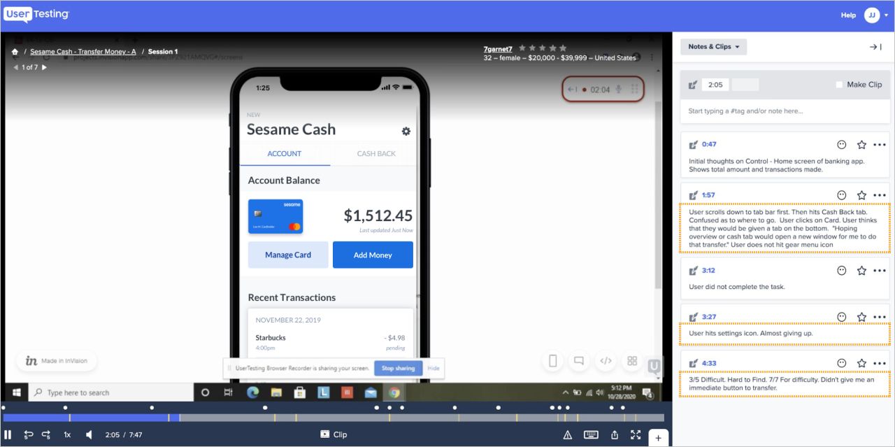
First, I conducted user testing of the existing Sesame Cash dashboard experience to uncover user pain points. This testing was conducted using both moderated and unmoderated approaches.
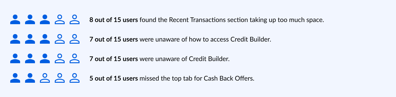
Testing with a group of 15 Sesame Cash users revealed the following key insights:
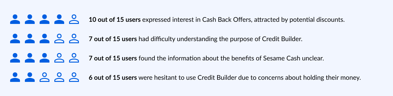
Testing with a group of 15 Credit-only users revealed the following key insights:
IDEATION
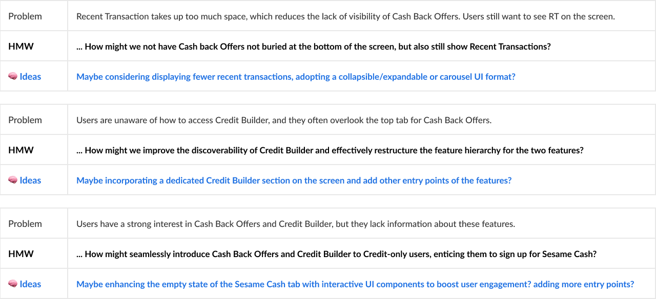
I then conducted a brainstorming session with stakeholders, product managers, and developers to collectively generate ideas for addressing the key user pain points identified in response to the framed challenges.
COMPETITIVE ANALYSIS
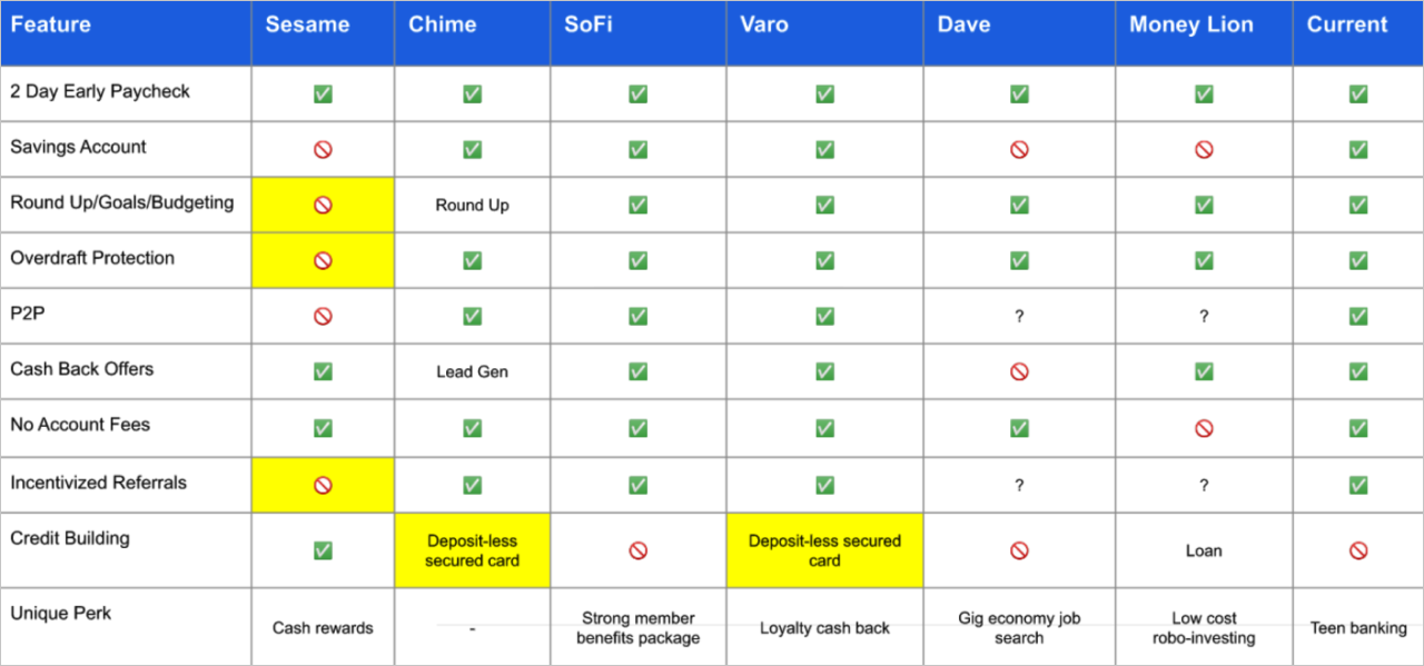
Following that, I conducted a competitive analysis of Credit Sesame's competitors to assess how they structured features within their apps. This analysis informed our discussions with stakeholders about restructuring Sesame Cash's feature hierarchy. For instance, Chime had 3 entry points for Credit Builder on its home screen, enhancing user adoption. I incorporated these insights into our Information Architecture for Sesame Cash to better align with user needs and business goals.
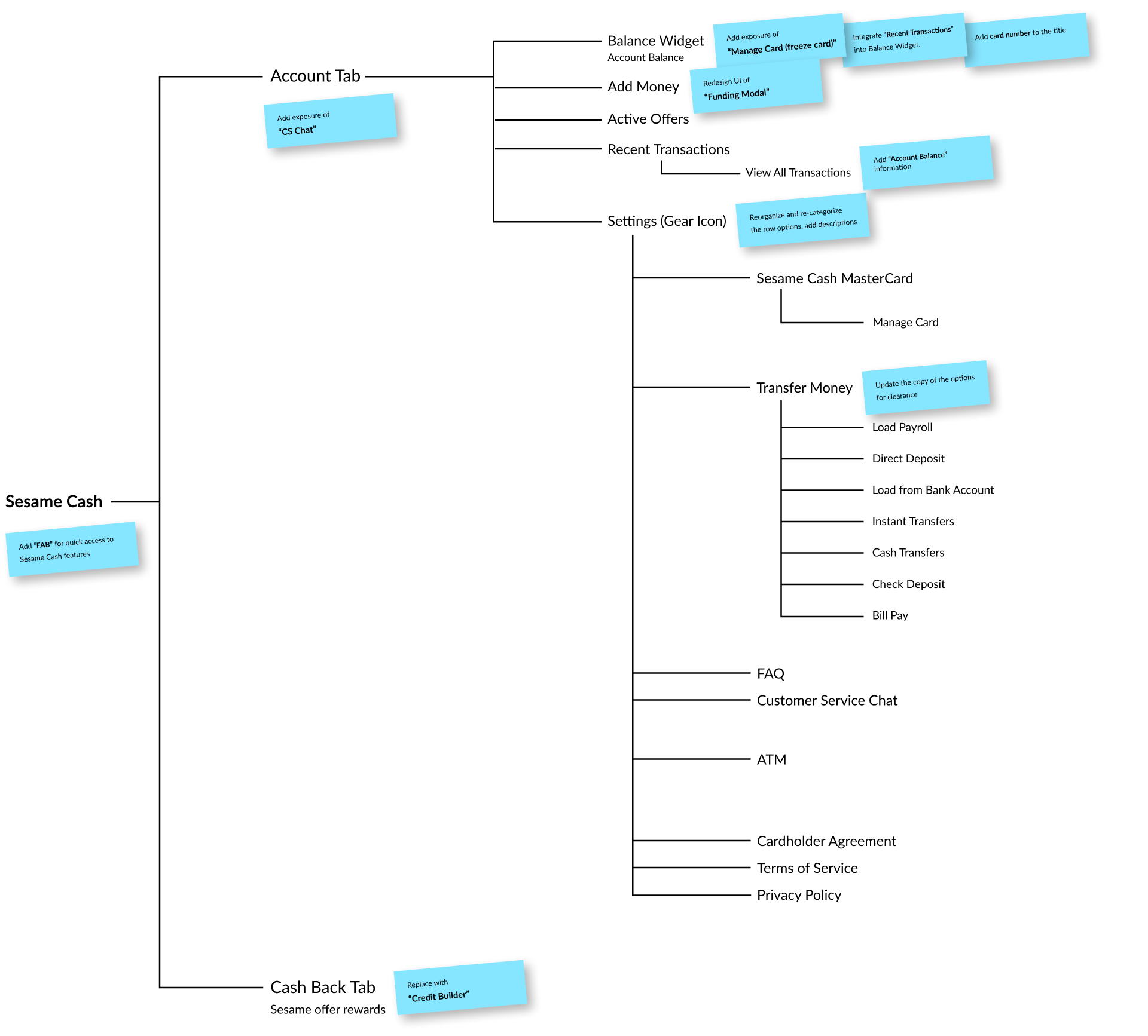
INFORMATION ARCHITECTURE AUDIT
I conducted an audit of the current information architecture (IA) of the Sesame Cash screen to have a clearer grasp of its structure. This way, I pinpointed key areas for addressing user pain points effectively. Also, I evaluated the potential impact of proposed changes on other screens and components. I used blue post-it notes to mark areas with potential ideas for design iterations.
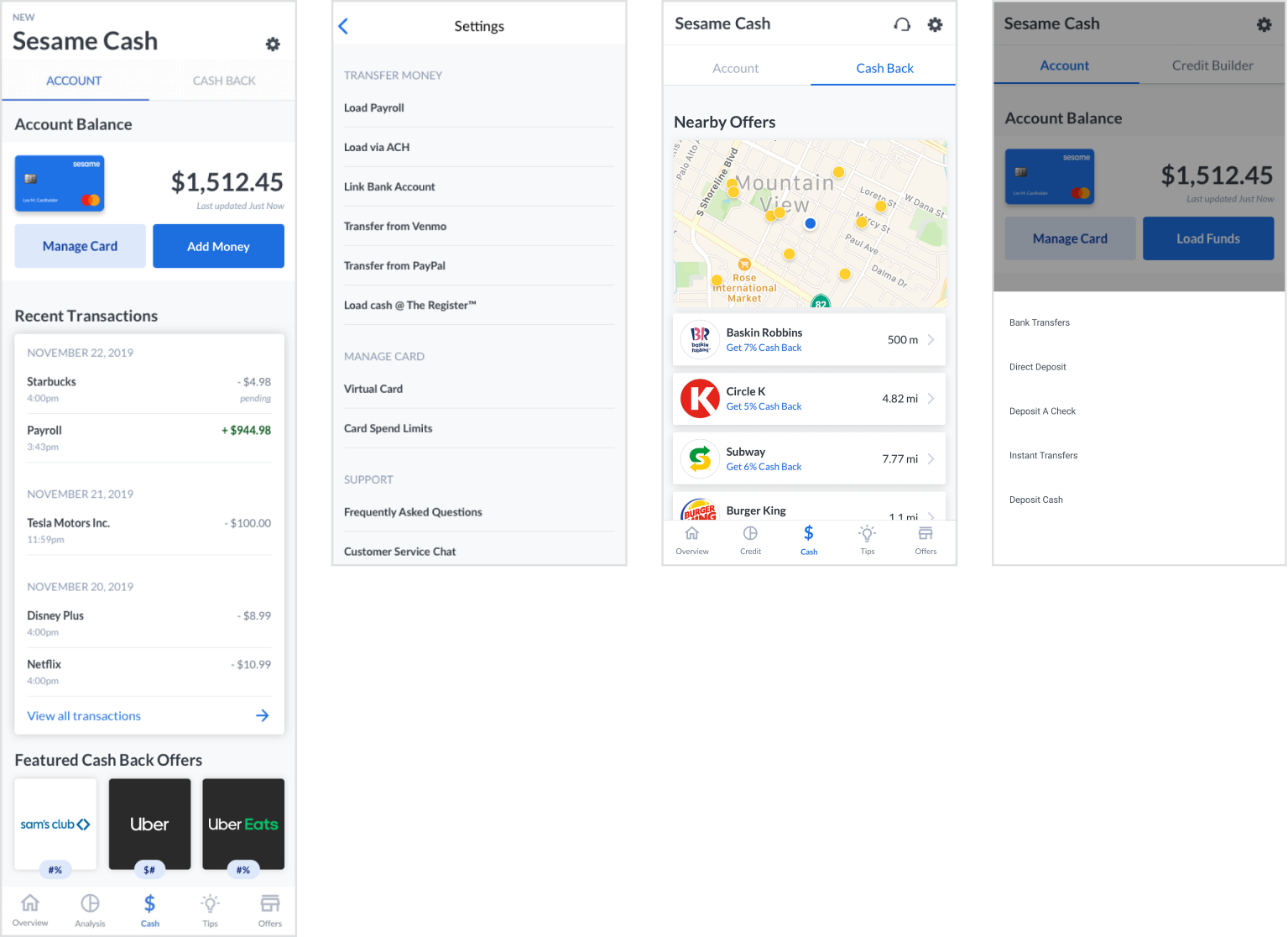
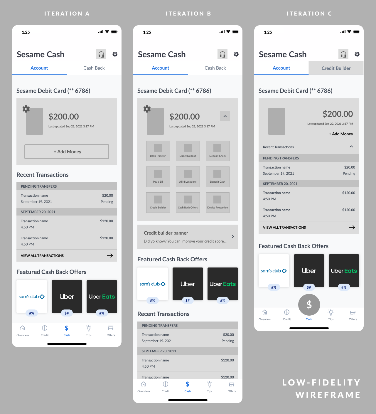
Low-fi Wireframe Iterations A, B, C
DESIGN ITERATIONS & USER TESTING
Based on the brainstormed ideas and research findings, I had an internal testing with three low-fi design iterations, which involved devs, pms stakeholders, and relevant team members for broad feedback on feasibility and business alignment. Next, I developed the designs to hi-fi screens and conducted in-depth user testing.
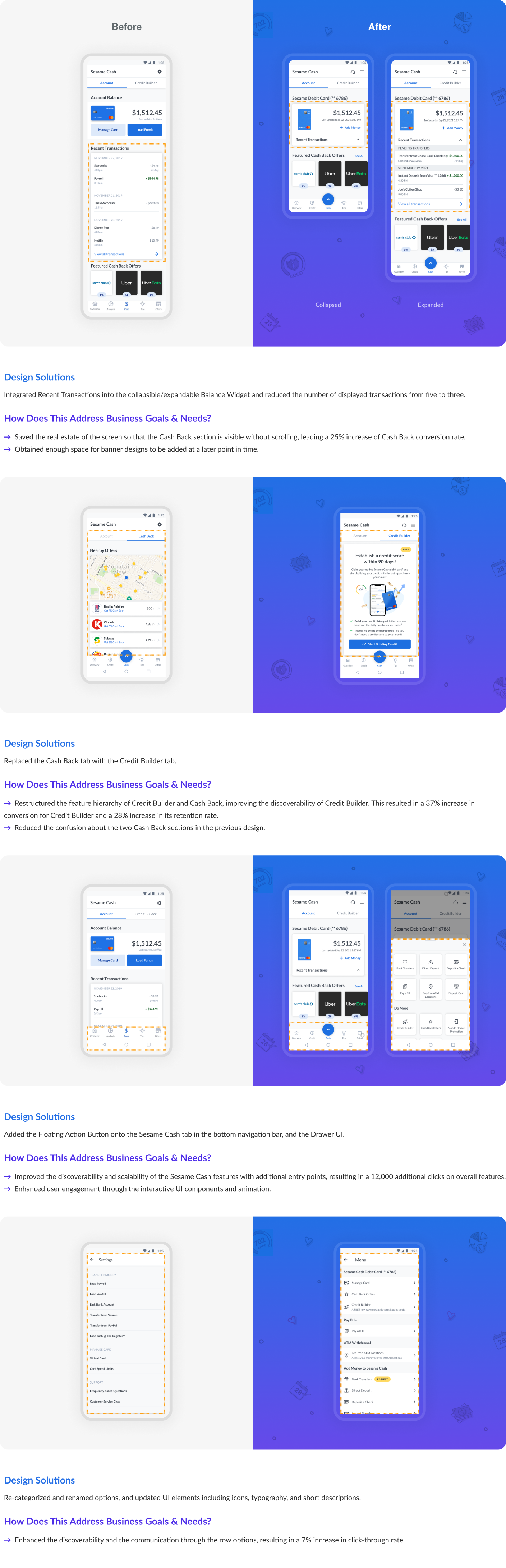
Synthesizing the testing results, I finalized the design, which is a combination of the strong components from each iteration. The final design addresses the framed problems below:
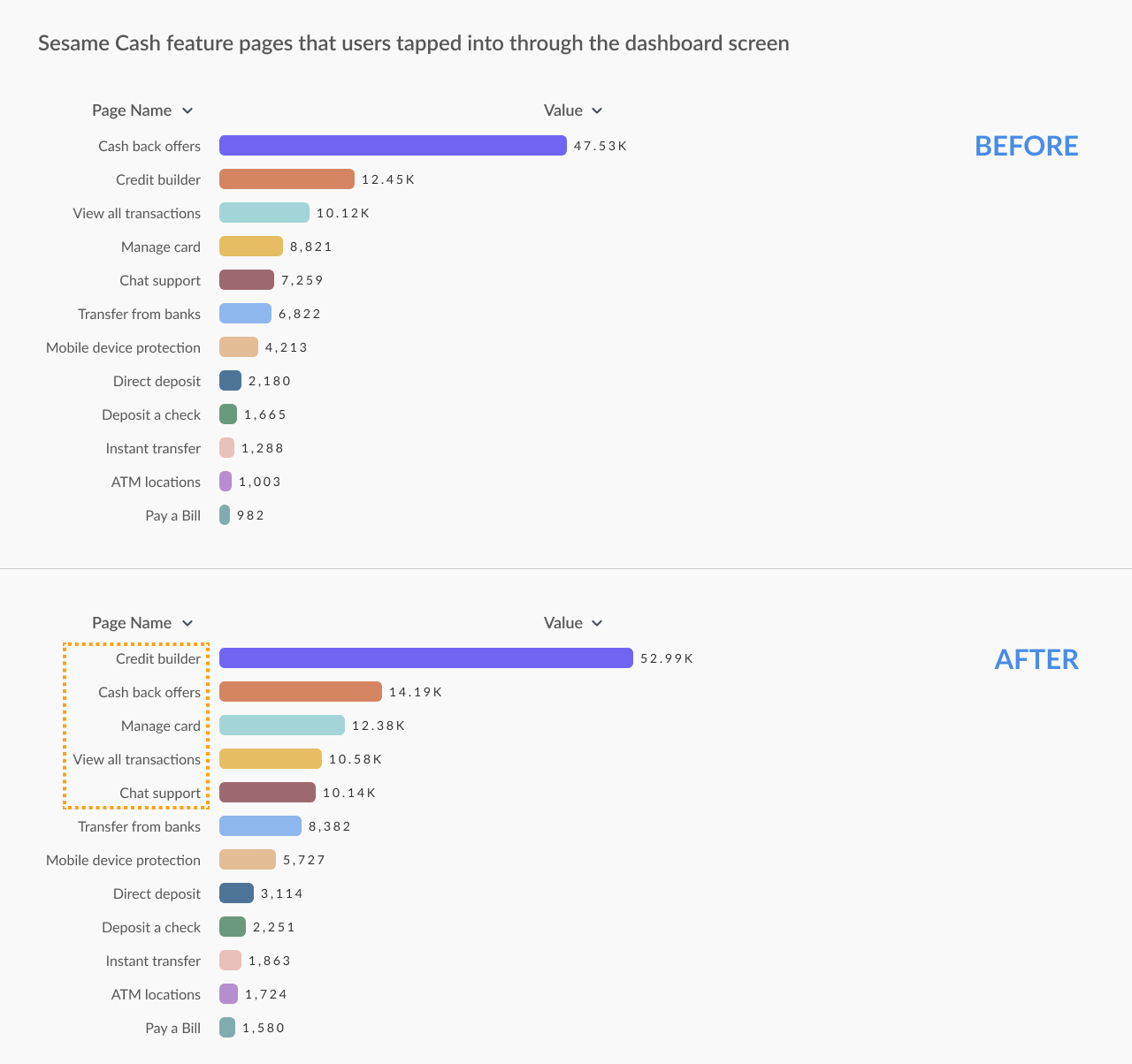
As a part of the design solution to enhance user engagement for Sesame Cash, I proposed the implementation of the Floating Action Button (FAB) component and the Drawer UI. The interaction design of these elements increased the number of clicks for Sesame Cash features by 12,000 over a three-month duration.
Illustration work for Sesame Cash
ILLUSTRATIONS
I created a number of illustrations for the Sesame Cash app screens.
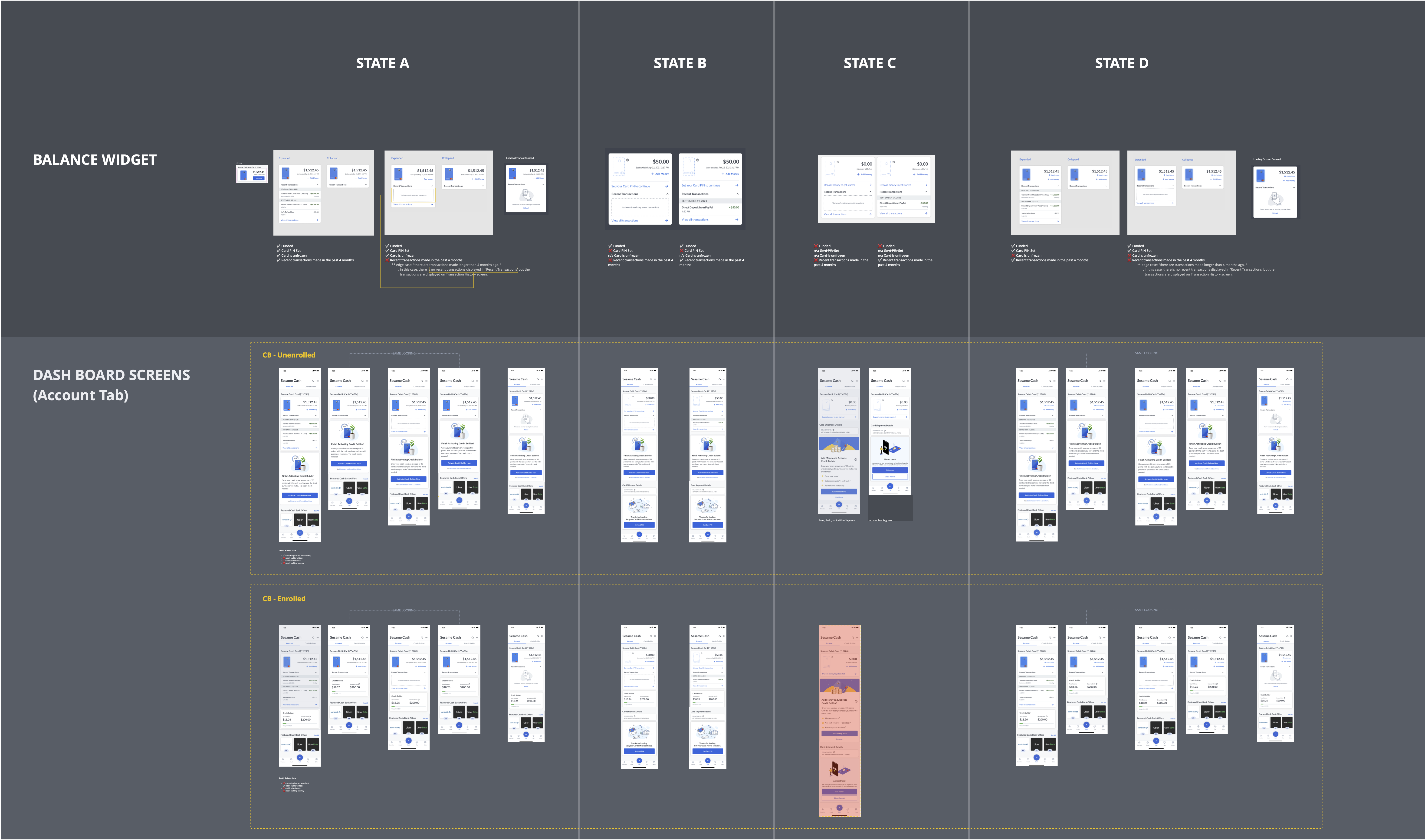
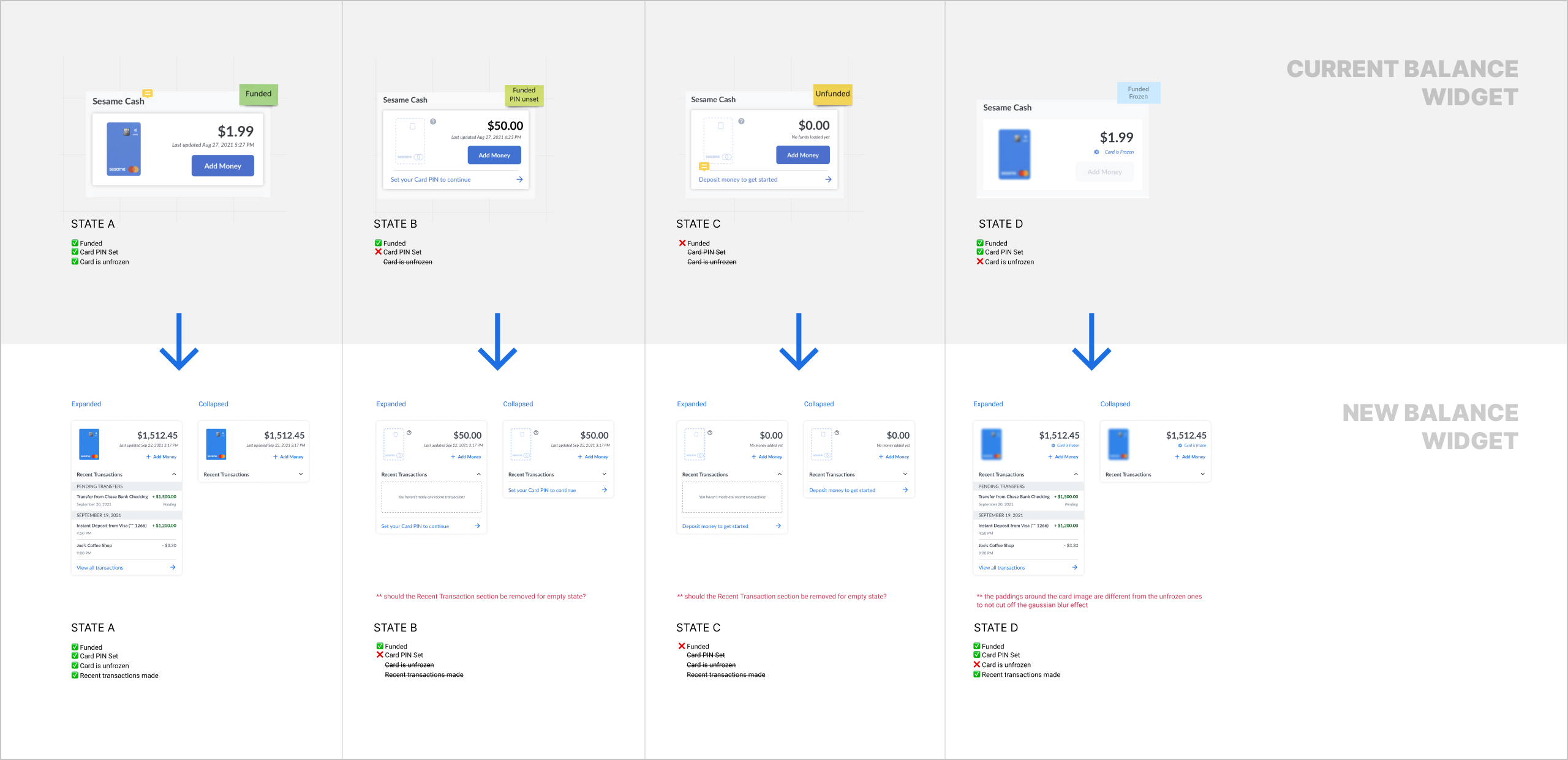
Balance Widget Component Documentation
COMPONENT DOCUMENTATIONS
As part of the deliverables, I provided several state documentations for the components that were affected by the Dashboard redesign, including the Balance Widget, Recent Transactions, and Credit Builder Tab.
UPDATE DESIGN SYSTEM
One of the most significant challenges faced during this project was the need to update multiple UI states due to even small UI changes. These states included pre/post signup, funded/unfunded account, pre/post set card pin, and various states of the balance widget and recent transactions, including empty, filled, and error states. To ensure that the teams had the necessary information, I provided multiple state documentations.
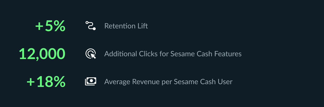
Shipping Sesame Cash Dashboard 2.0 in mid-September 2022 led to a 5% increase in retention rate, 12,000 more taps on Sesame Cash features, and an 18% increase in average revenue per user. User feedback was positive, stating the experience was more intuitive and easy to navigate compared to the previous version.
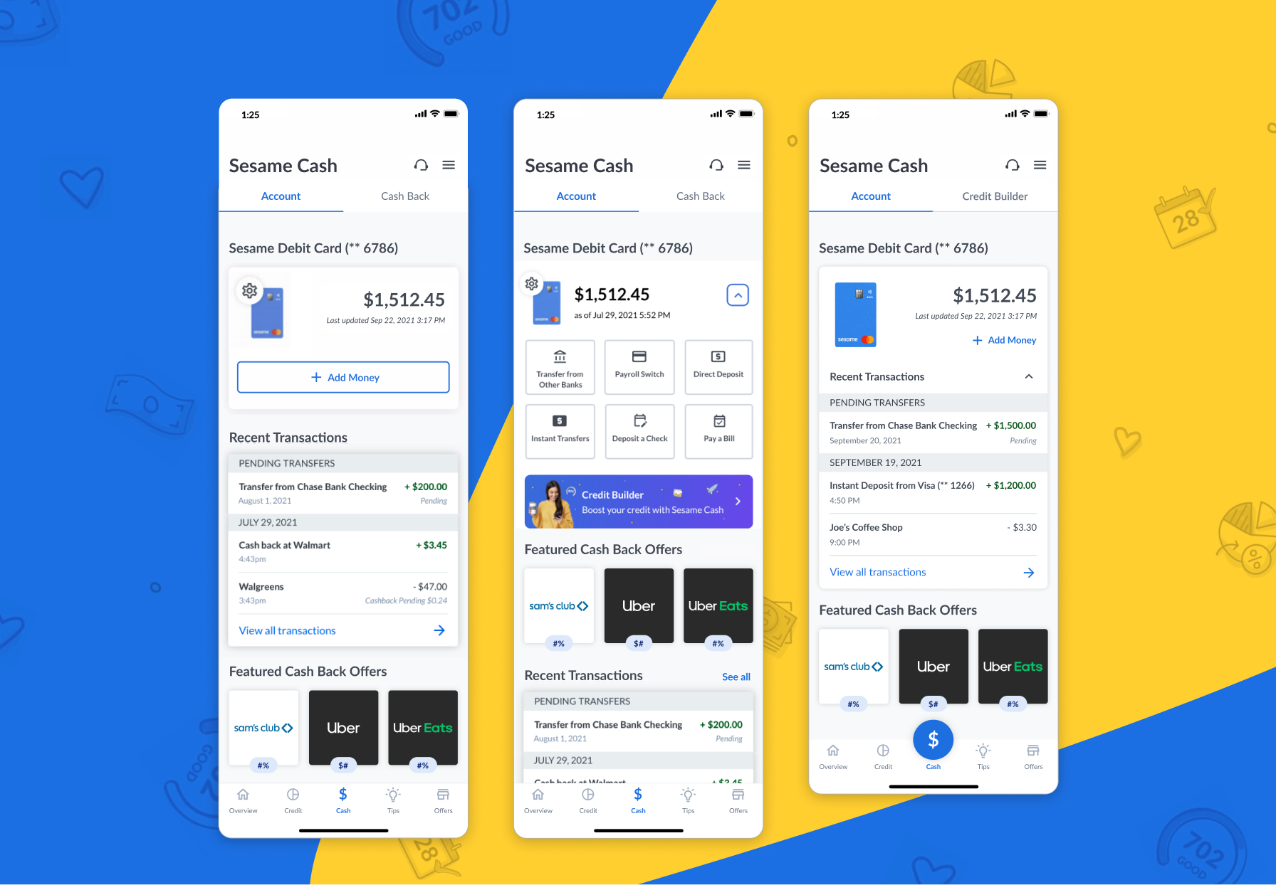
New Sesame Cash Dashboard Experience
💫 TAKEAWAYS
I learned that dashboard design is crucial in meeting the needs of the end user and helping them reach their goals. By reorganizing the information hierarchy and redesigning UI elements, I optimized the dashboard screen and maximized communication based on user testing data.
👣 NEXT STEPS
Updating the web app UI/UX accordingly.
Improving the experience, conducting usability testing, iterating, and optimizing.
Exploring more on the banner UI/UX design to advertise different features in other tabs of the app.
Analyzing the data generated by the updated UI/UX of Cash Back Offers to optimize.