✓ Attract and non-STACK users to sign up and deposit funds via secure and instant P2P flow.
✓ Marketing P2P feature to improve customer conversion.
✓ Improve product and service quality by rebalancing the informational and visual hierarchy of the STACK app.
DESIGN GOALS & CONSTRAINTS
✓ Provide scalable deisgn for the future features, such as Referral Program, Split Bill, Transaction Details, etc.
✓ Create Email designs in accordance with the mobile experience.
✓ Provide guidance for adding P2P to the web app.
RESEARCH
USER SURVEY & COMPETITIVE ANALYSIS
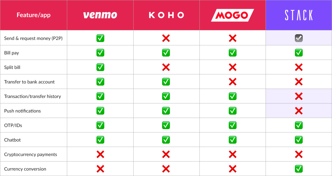
To understand the competition and identify opportunities, I conducted user surveys and competitive analysis. Considering the resources and the project timeline, the Our team decided to prioritize the functions, Send & Request money, Transaction/transfer history, in-app push notifications, and confirmation emails for v1.
IDEATE
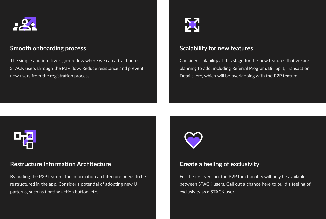
THE OPPORTUNITIES WE WANT TO CALL OUT
Through HMW & brainstorming, I called out some opportunities for P2P and used this knowledge to frame the design challenges.
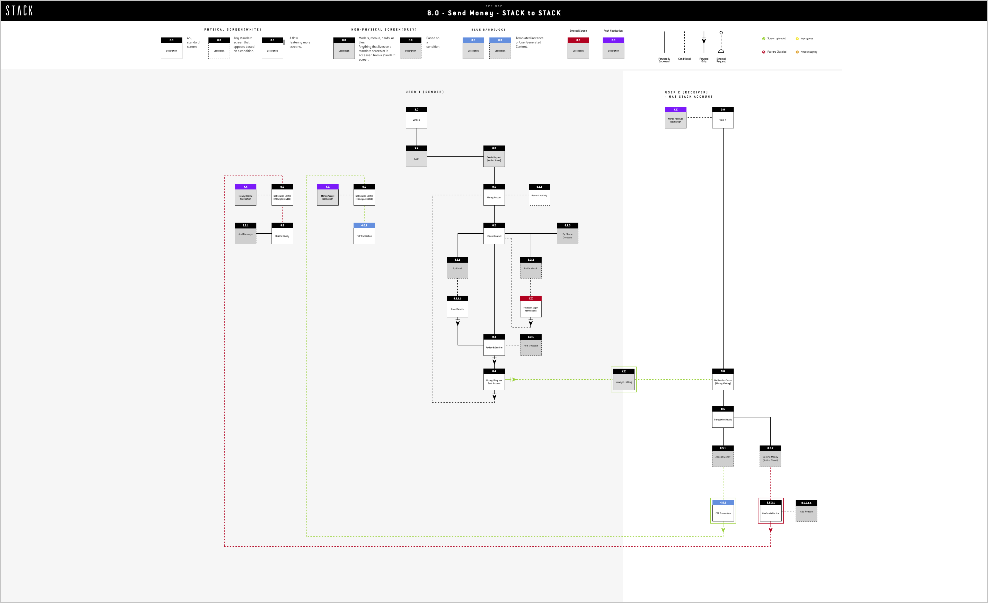
Some App Map of STACK P2P
DESIGN
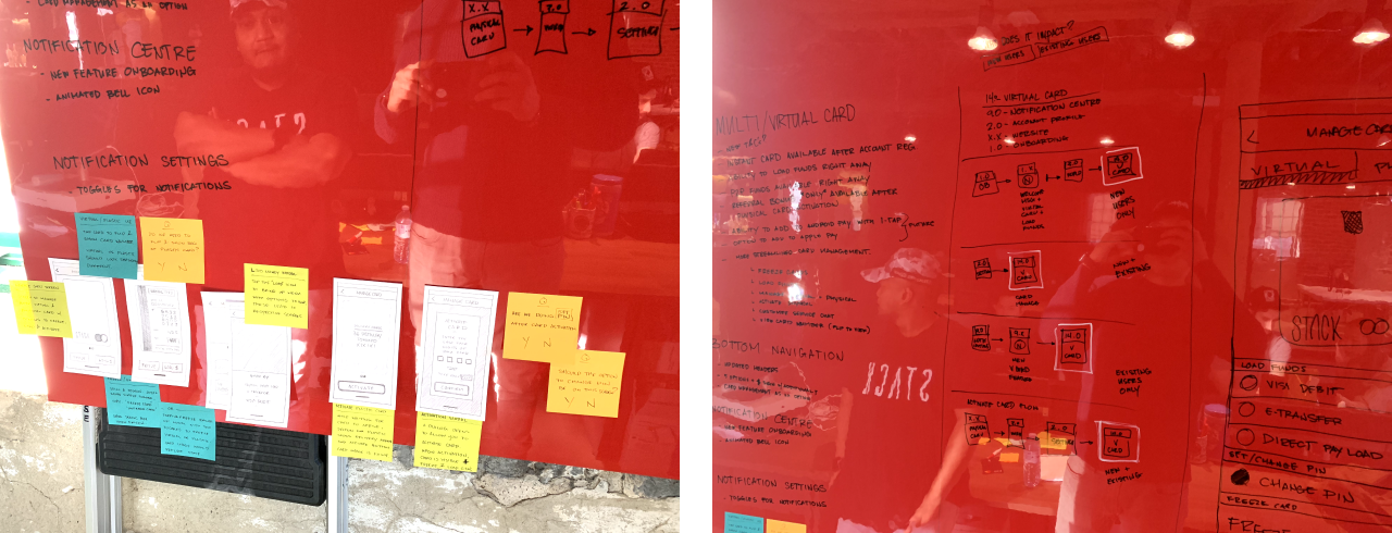
EARLY DESIGN & FORMATIVE USER TESTING
Based on the ideation, I quickly worked on the app map and carried out early user testing with less complete designs to optimize the efficiency. I got to pinpoint and prioritize real design issues before they become baked into the real design so we could iterate on the design more rapidly and accurately.
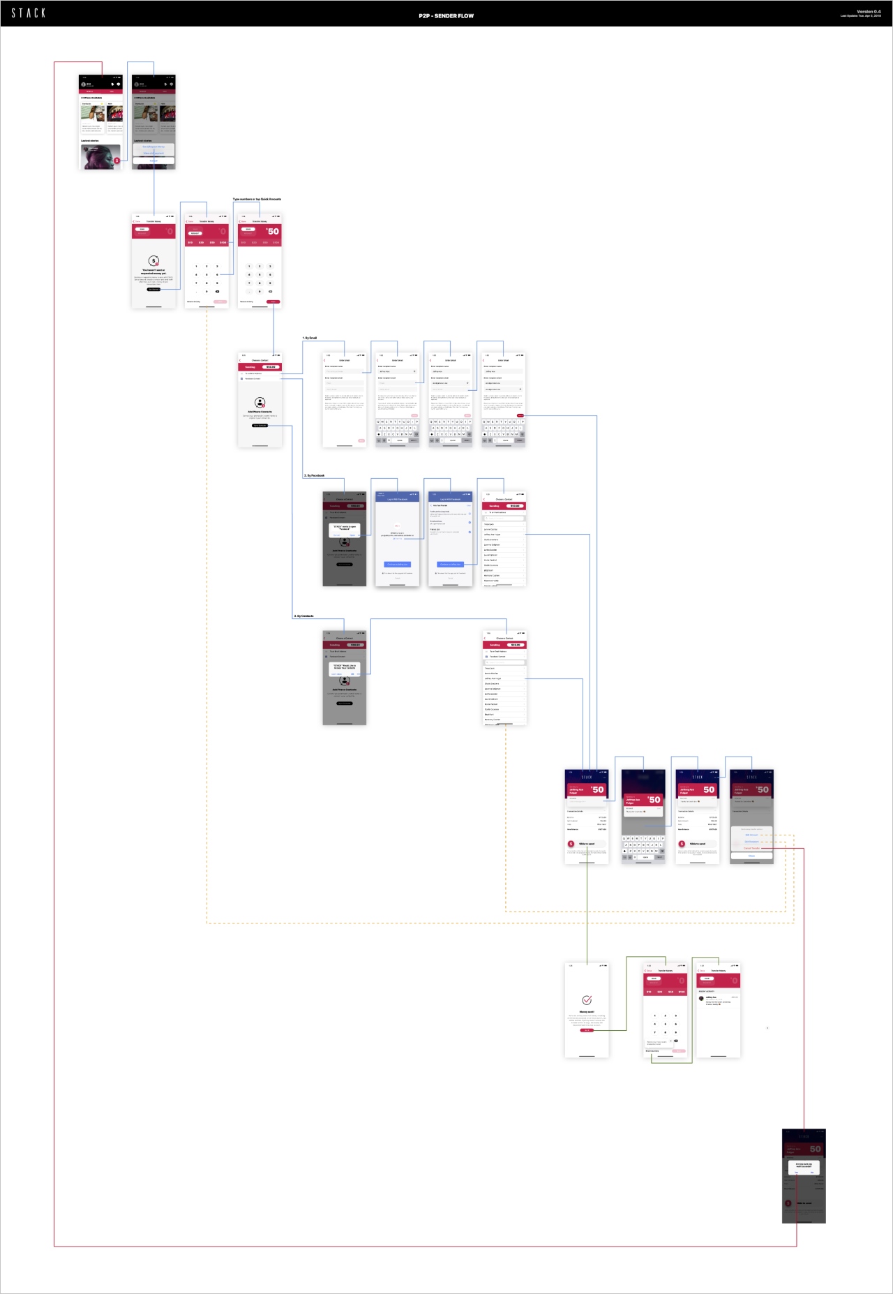
Sender Screen Flow Documentation
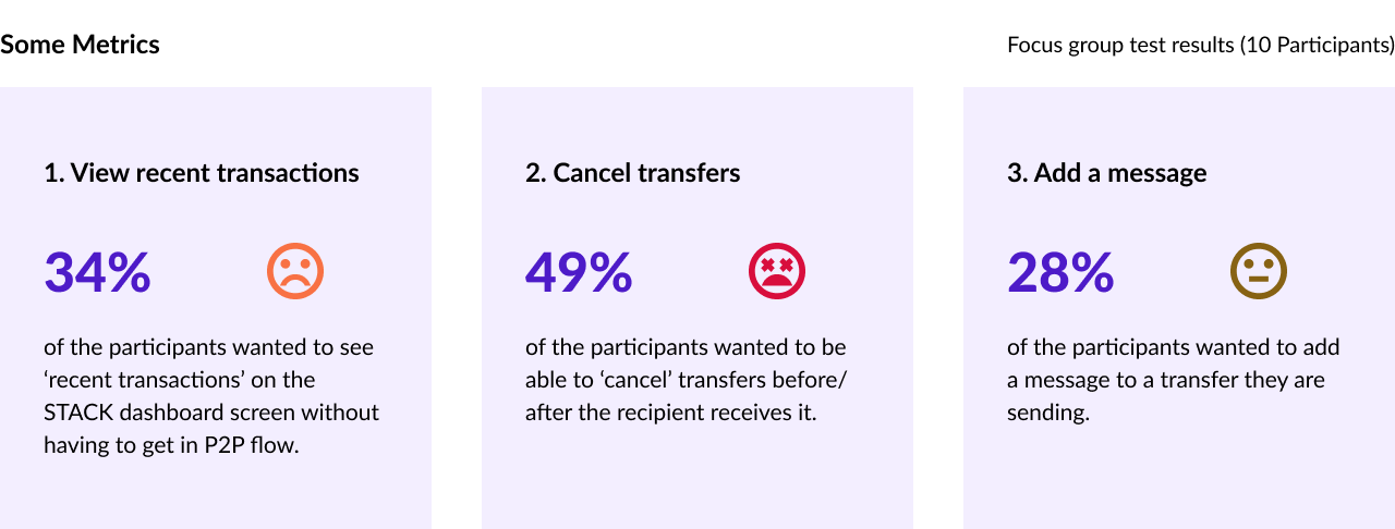
USABILITY TESTING
TESTING & RESULTS
Reflecting the findings, I designed a prototype and conducted external usability tests to validate the features. We learned:
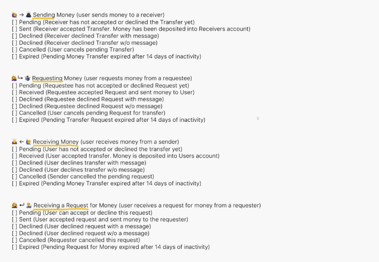
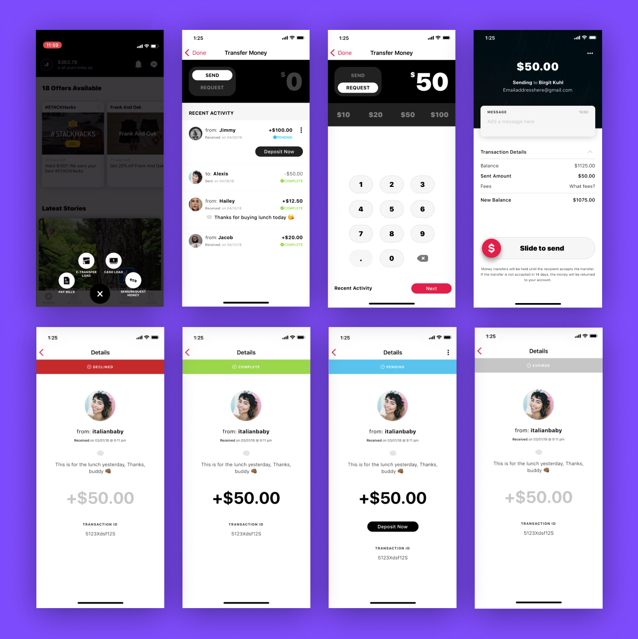
SEND & REQUEST MONEY - ALL TRANSFER STATES
When the big flows were validated, I tried to cover all transfer states and edge cases, breaking down each of them.
INTERACTION DESIGN
One of the biggest user pain points was that users accidentally tap the 'Sent/request Money' button in the confirmation screen, and, afterwards, want to cancel the action. I suggested adopted the interactive slider component for solving this user pain point and enhancing the user engagement and interactivity.
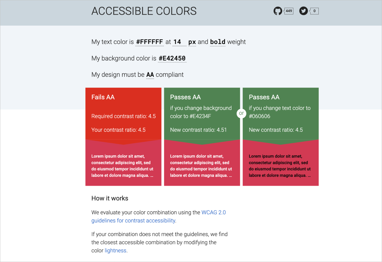
ACCESSIBLE DESIGN
For an optimal UX, I worked on optimizing the app elements more accessible, such as image captions, colour contrast, as well as voice over accessibility in iOS & Android.
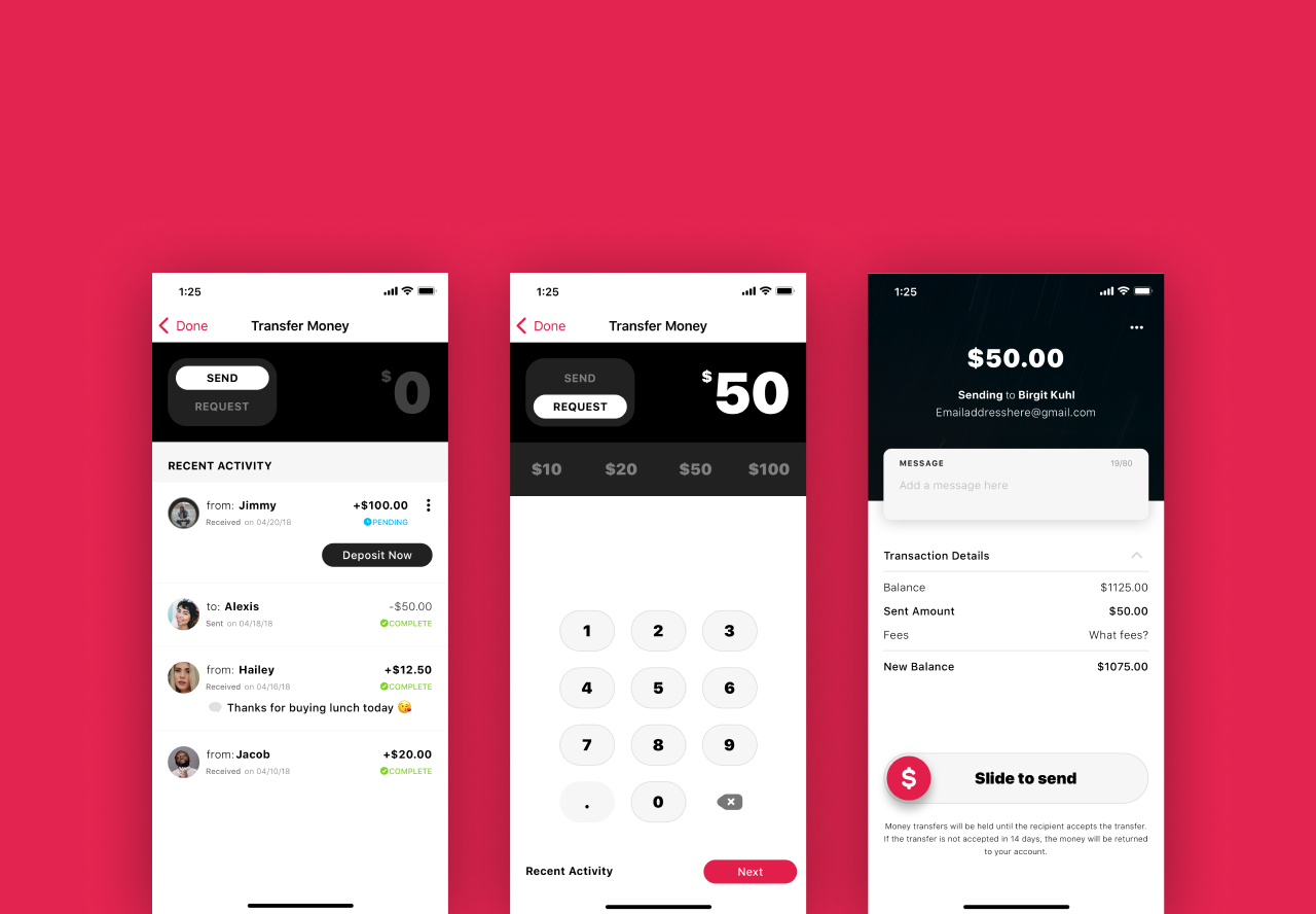
FINAL DESIGN DELIVERABLES
MOBILE APP SCREEN DESIGN
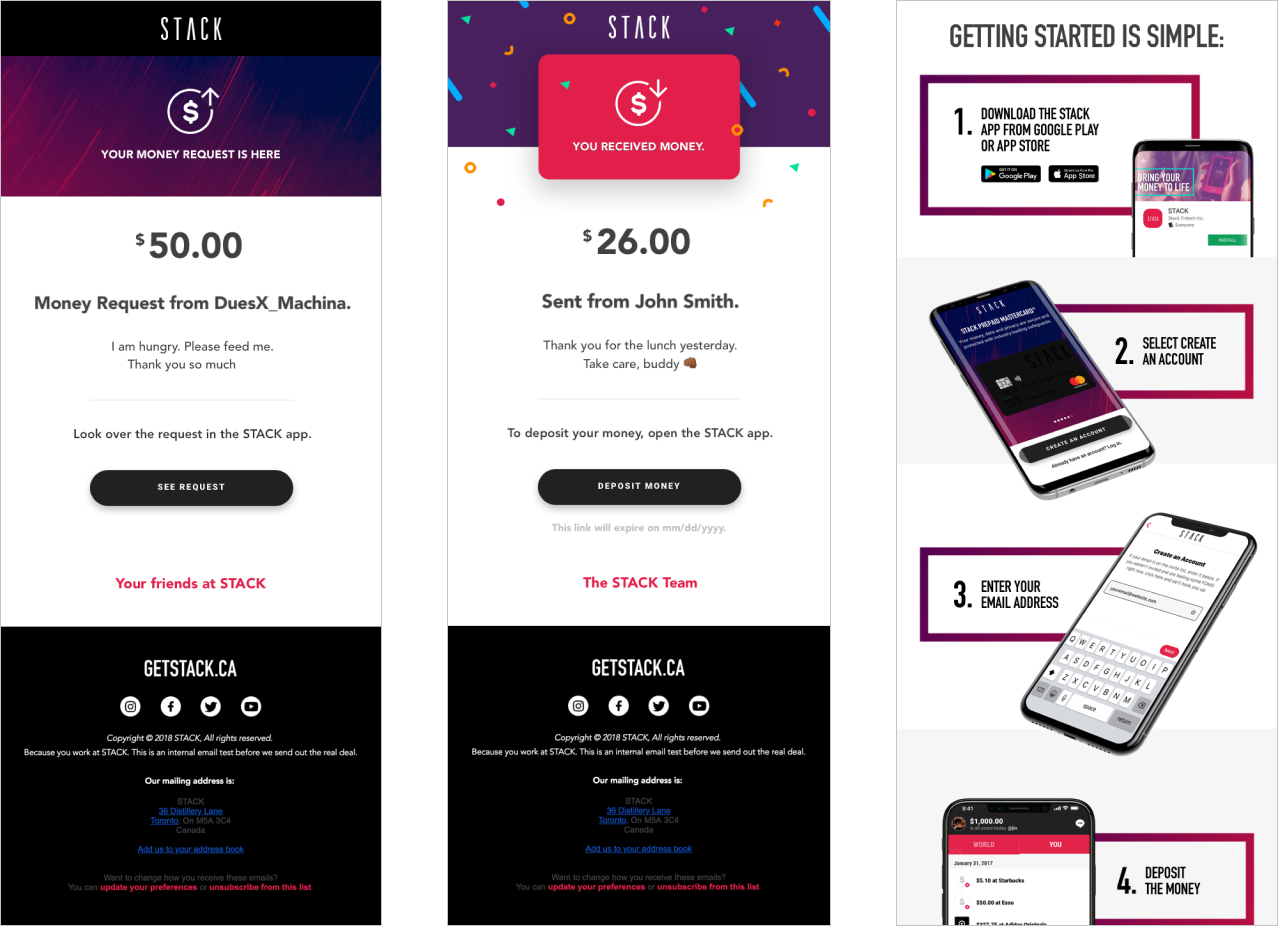
RESPONSIVE EMAIL DESIGNS
Aligning P2P transactions, I designed UX/UI for confirmation emails in HTML and CSS. The emails were designed for both light & dark modes. I learned how to optimize email designs, considering the limitations of HTML emails. I set the email HTML size lower than 100 KB to avoid message clipping and tried to keep the email size under 1 MB using only few images in PNG.
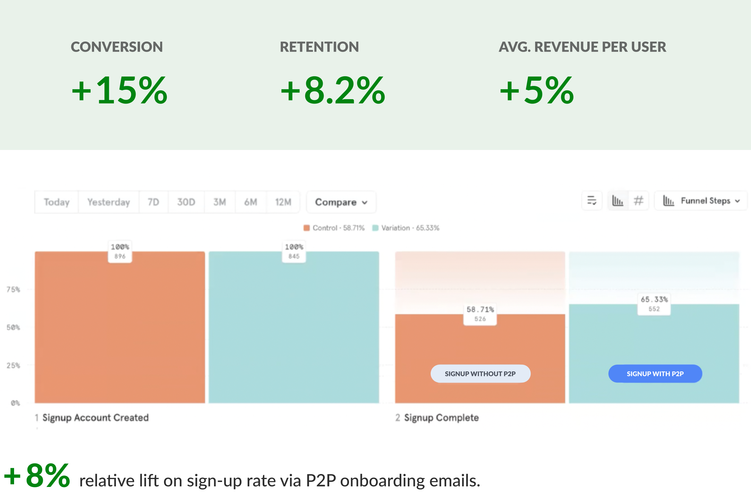
DATA RESULTS
METRICS IMPROVEMENT
After one and a half months, the team shipped the P2P feature in mid September in 2018. As 36% of the STACK users were using P2P, we received positive feedback from our STACK users, saying that the experience is intuitive, simple, and feels exclusive. Comparing the previous app version without the P2P feature, we saw the increase.
STACK P2P Navigation
💫 TAKEAWAYS
Throughout this project, I learned there is a delicate balance between business, user needs, and technical feasibility. As a product designer, I need to take into consideration of all these factors in order to create the best possible product solution.
Working on P2P, I learned that a digital product is similar to a living organism that interacts as a holistic system. This is because all features and flows in the app constantly affect each other, sharing the information architecture (feature hierarchy) organized and grouped together.
👣 NEXT STEPS
Feature parity so we can add the P2P feature to the web app.
Revisiting some UX flows, conducting usability testing, iterating, and optimizing based on feedback.
Adding a Bill Split functionality, in connection with P2P, based on the user need.
Exploring profile carousel UI for most frequently interacted users.